
Website accessibility is defined as the practice of building digital content that every person can use, including people with disabilities. WCAG 2.2 Level AA is the recognized benchmark for commercial websites in 2026, and it sits at the center of this improve website accessibility 2026 guide. Legal frameworks like the Americans with Disabilities Act and Germany's BFSG make compliance a business requirement, not a choice. The challenge is real: automated tools catch only 30–40% of baseline issues, which means you need a structured approach that combines automated scanning with hands-on testing.
What do you need to start improving website accessibility in 2026?
Before you fix anything, you need a clear picture of where your site stands. A baseline audit using automated tools gives you a fast starting point. From there, you layer in manual testing to catch what the scanners miss.
Core standards to know
WCAG 2.2 Level AA organizes requirements around four principles: Perceivable, Operable, Understandable, and Robust. Each principle breaks into specific success criteria. For 2026, the most enforced criteria cover color contrast, keyboard operability, form labels, and focus visibility. Understanding these four pillars before you open a code editor saves you from fixing the wrong things first.

Automated scanning tools
Three tools cover most of the automated scanning ground: axe DevTools, WAVE, and Google Lighthouse. Run all three on your key pages because each flags different issue categories. Lighthouse integrates directly into Chrome DevTools, making it the fastest starting point for most developers. WAVE provides a visual overlay that helps non-technical stakeholders understand what is broken.
- axe DevTools: Best for developers; integrates with CI/CD pipelines and flags ARIA misuse.
- WAVE: Best for visual reporting; highlights errors directly on the rendered page.
- Google Lighthouse: Best for quick audits; built into Chrome and covers performance alongside accessibility.
- NVDA (Windows) and VoiceOver (macOS/iOS): Free screen readers for manual testing.
Pro Tip: Run Lighthouse in an incognito window to avoid browser extensions inflating or deflating your accessibility score.
Semantic HTML as your foundation
Semantic HTML is the single most effective starting point for accessible code. Elements like <nav>, <main>, <button>, and <label> carry built-in accessibility features that ARIA cannot replicate reliably. Plain language and meaningful link text also matter here. Screen readers read link text out of context, so "click here" tells a user nothing, while "download the 2026 compliance checklist" tells them exactly what they get.
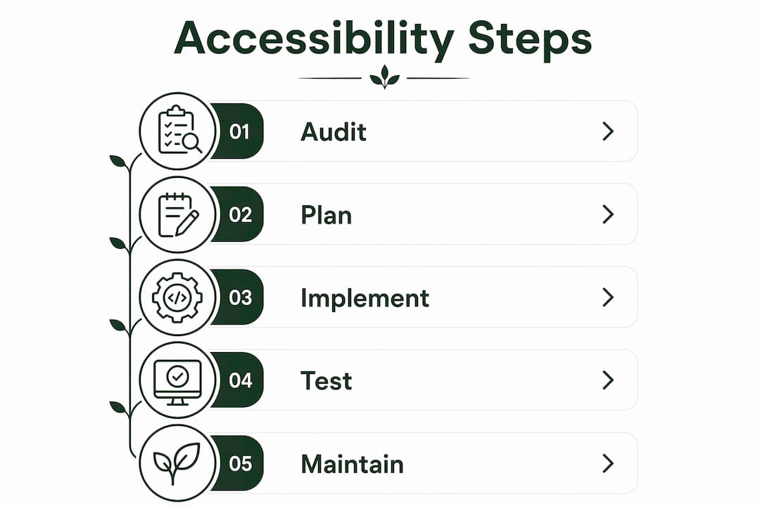
Step-by-step checklist to fix common accessibility issues
This checklist targets the most frequent WCAG 2.2 AA failures. Work through it in order because earlier items often unblock later ones.
-
Fix color contrast. Normal text needs a 4.5:1 contrast ratio; large text (18pt or 14pt bold) needs 3:1. Use the WebAIM Contrast Checker to test every text and background combination on your site. Low contrast is the single most common WCAG failure across commercial websites.
-
Add alt text to every meaningful image. Write alt text that describes the image's function, not just its appearance. A button with a magnifying glass icon gets alt text of "Search," not "magnifying glass." Mark purely decorative images with
alt=""so screen readers skip them. -
Label every form input. Every
<input>,<select>, and<textarea>needs a visible<label>element linked via theforattribute. Placeholder text does not count as a label. It disappears when users start typing, leaving people with cognitive impairments without context. -
Structure headings logically. Use one
<h1>per page, then<h2>for major sections,<h3>for subsections. Never skip heading levels for visual styling. Screen reader users navigate pages by jumping between headings, so a broken hierarchy creates a confusing experience. -
Replace vague link text. Audit every link on your site. Replace "read more," "here," and "click this" with descriptive phrases that make sense out of context. Descriptive links improve usability for screen reader users and non-native speakers alike.
-
Restore or replace focus indicators. Many CSS resets remove the default browser focus ring. Removing the default focus outline without a visible custom replacement makes your site unusable for keyboard users. Custom focus rings must contrast at least 3:1 with the surrounding background.
-
Audit your ARIA usage. The first rule of ARIA is to avoid it when a native HTML element does the same job. Use ARIA only for dynamic widgets without native equivalents, such as tabs, modals, and combo boxes. Misused ARIA roles confuse screen readers and break navigation.
-
Check touch target sizes. WCAG 2.5.8 requires minimum touch targets of 24x24 CSS pixels. Buttons and links that are too small create barriers for users with motor impairments and frustrate everyone on mobile.
Pro Tip: After fixing contrast and focus issues, rerun axe DevTools. Many secondary errors disappear once the foundational HTML structure is clean.
How do you test website accessibility manually?
Automated tools detect roughly one-third of WCAG violations. The rest require manual testing. Manual testing reveals issues that no scanner can catch, including broken focus management, illogical reading order, and screen reader confusion caused by dynamic content.
Keyboard navigation testing
Unplug your mouse and navigate your entire site using only the Tab, Shift+Tab, Enter, and arrow keys. Every interactive element must be reachable and operable. Check for these specific failure points:
- Tab order: Does focus move in a logical sequence that matches the visual layout?
- Focus visibility: Can you always see which element has focus? If not, your focus indicator is broken.
- Focus traps: Does focus get stuck inside a modal or widget without a way to escape? A modal should trap focus intentionally while open, then release it when closed.
- Skip links: Does your site offer a "Skip to main content" link as the first focusable element? This lets keyboard users bypass repeated navigation on every page.
Screen reader testing
Testing with NVDA on Windows and VoiceOver on macOS gives you the closest experience to what users with visual impairments encounter. Start by navigating your homepage using only the screen reader's heading navigation shortcut. Then test a complete user flow, such as filling out a contact form or completing a purchase.
"The goal of screen reader testing is not to find every WCAG rule violation. It is to experience your site as a blind user does and identify where the experience breaks down completely."
Common screen reader failures include images with missing or redundant alt text, form errors announced without identifying which field failed, and dynamic content updates that are never communicated to the user. ARIA live regions fix the last problem by announcing changes to assistive technology automatically.
Testing dynamic content
Single-page applications and JavaScript-heavy interfaces create unique challenges. When content updates without a full page reload, screen readers may not announce the change. Test every modal, alert, tab panel, and autocomplete widget with a screen reader to confirm that state changes are communicated clearly.
How do you maintain accessibility over time?
Accessibility is not a one-time fix. Every content update, new feature, and design change is an opportunity to introduce regressions. The teams that maintain accessible sites treat accessibility the same way they treat security: as an ongoing process, not a project milestone.
Build accessibility into your workflow
The most effective approach is to add accessibility checks to your pull request review process. Require developers to run axe DevTools before merging any UI change. Add Lighthouse CI to your deployment pipeline so that accessibility score drops trigger a build failure. This catches regressions before they reach production.
Integrating accessibility early through mobile-first design and semantic HTML reduces the cost of fixes significantly. Retrofitting an inaccessible site costs far more in developer time than building accessibly from the start.
Common regression triggers
| Trigger | Typical accessibility failure |
|---|---|
| New marketing banner | Missing alt text on promotional images |
| Form redesign | Labels removed or replaced with placeholders |
| Navigation update | Tab order broken; skip link removed |
| Third-party widget added | Focus trap introduced; ARIA conflicts created |
| CSS theme update | Focus ring removed; contrast ratios broken |
Stay current with evolving standards
WCAG 3.0 is in development and will introduce new conformance models. Regional laws also change. Germany's BFSG took effect in June 2025, and similar legislation is advancing across the European Union. Subscribe to the W3C Web Accessibility Initiative newsletter and set a quarterly calendar reminder to recheck your site against the latest guidance.
Pro Tip: Establish a user feedback channel specifically for accessibility issues. Real users with disabilities will find problems that no automated tool or developer test ever surfaces.
Key takeaways
Accessible websites require WCAG 2.2 Level AA compliance, combined manual and automated testing, and ongoing maintenance built into your development workflow.
| Point | Details |
|---|---|
| WCAG 2.2 AA is the 2026 standard | Meet contrast, keyboard, label, and focus criteria to satisfy most legal frameworks. |
| Automated tools have real limits | Scanners catch only 30–40% of issues; manual keyboard and screen reader testing covers the rest. |
| Semantic HTML beats ARIA | Use native HTML elements first; add ARIA only for dynamic widgets with no native equivalent. |
| Focus indicators are non-negotiable | Custom focus rings must contrast at least 3:1 with the background if you remove browser defaults. |
| Accessibility prevents regressions | Add axe DevTools to PR reviews and Lighthouse CI to deployments to catch new issues before launch. |
Accessibility is a design decision, not a compliance checkbox
I have worked on enough web projects to say this plainly: teams that treat accessibility as a legal checkbox always spend more money than teams that treat it as a design standard. The checkbox approach means you audit at the end, find hundreds of issues, and scramble to fix them before a launch deadline. The design standard approach means you write a <label> when you write the <input>, and you never have a scramble.
The 2026 standards represented by WCAG 2.2 AA are not unreasonably demanding. The contrast ratios, touch target sizes, and focus indicator requirements are things that good visual design should already satisfy. When they are not satisfied, it usually means the design process skipped users with disabilities entirely. That is the real problem, and no audit tool fixes it.
What I have found genuinely useful is bringing a screen reader into design reviews, not just development reviews. When a designer hears VoiceOver read their prototype aloud, they immediately understand why "learn more" is a useless link label. That experience changes behavior faster than any style guide.
The business case is straightforward too. Accessibility integrated early improves overall UX and SEO for all users, not just users with disabilities. Semantic HTML helps search engines crawl your content. Descriptive link text improves click-through rates. Clear heading structure helps everyone scan a page faster. Accessibility and good web design are the same thing, viewed from different angles.
— jacopo
How Talivo builds accessibility into your website from day one
Accessibility compliance starts at the code level, and that is exactly where Talivo operates. Talivo builds websites with AI, generating mobile-first, semantically structured code that aligns with WCAG 2.2 AA from the first line. Whether you are converting a Google Maps listing into a full site or redesigning an outdated URL, the output follows accessible web standards by default.
Business owners who lack the time to run manual audits benefit from Talivo's AI-guided build process, which applies proper heading structure, labeled form inputs, and meaningful alt text automatically. Developers who want a compliant starting point can use Talivo to generate a clean foundation and build from there. See how the platform works at Talivo and skip the retrofit entirely.
FAQ
What is WCAG 2.2 Level AA?
WCAG 2.2 Level AA is the Web Content Accessibility Guidelines standard that defines the minimum accessibility requirements for commercial websites in 2026. It covers contrast ratios, keyboard operability, form labels, focus indicators, and more.
How much of my site can automated tools actually check?
Automated scanners like axe, WAVE, and Lighthouse detect roughly 30–40% of WCAG violations. The remaining issues require manual keyboard navigation and screen reader testing to identify.
Is website accessibility legally required in 2026?
Yes. Legal mandates including the ADA and Germany's BFSG make accessibility compliance a binding requirement for most commercial websites. Enforcement is increasing across North America and Europe.
What is the minimum color contrast ratio for body text?
Normal body text requires a contrast ratio of at least 4.5:1 between text and background. Large text, defined as 18pt or 14pt bold, requires a minimum ratio of 3:1 per WCAG 2.2 AA.
When should I use ARIA on my website?
Use ARIA only when no native HTML element provides the required accessibility feature. Native HTML elements like <button>, <nav>, and <label> carry built-in accessibility support that ARIA cannot reliably replicate.