
Whitespace in web design is the intentional use of empty space around and between elements to improve clarity, guide user focus, and enhance usability. Designers call it "negative space," but that term undersells its power. The role of whitespace in web design goes far beyond aesthetics. It is an active structural tool that controls readability, visual hierarchy, and how users move through a page. W3C WCAG and Nielsen Norman Group both recognize whitespace as a core accessibility requirement, not a stylistic luxury. Get it right, and your site becomes easier to read, easier to trust, and more likely to convert.
How does whitespace shape visual hierarchy and readability?
Whitespace defines what belongs together and what stands apart. This is the Gestalt principle of proximity at work. Elements placed close together read as a group. Elements separated by space read as distinct. Your eye follows that structure automatically, without conscious effort.
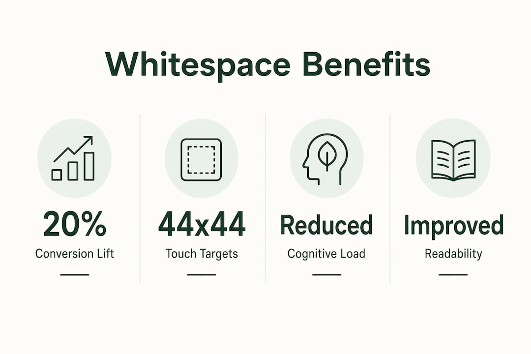
Line height, margins, and padding are the three main levers. Line height below 1.4 on body text forces lines too close together, slowing reading speed. Generous margins around headings signal that a new topic is starting. Padding inside buttons makes them easier to tap on mobile and easier to spot on desktop. Increasing paragraph spacing improves reading comprehension by up to 20%, and uncluttered layouts are perceived as more credible. That 20% gain comes from reducing the visual effort required to track from one line to the next.

Poor spacing creates a wall of content. Users scan pages before they read them. A page with no breathing room gives the eye nowhere to rest, so users bounce. A page with clear spacing creates natural stopping points that pull the eye toward headlines, calls-to-action, and key facts.
Key mechanisms whitespace uses to improve readability:
- Proximity grouping: Related items cluster together; unrelated items separate, reducing the need for labels.
- Framing: Space around a headline makes it the most prominent element in its zone.
- Scanning paths: Vertical whitespace between sections creates a natural top-to-bottom reading flow.
- CTA isolation: Calls-to-action surrounded by whitespace stand out without aggressive color or animation.
Pro Tip: Test your layout at arm's length on a phone screen. If you can't immediately identify the headline and the primary call-to-action within two seconds, your spacing is too tight.
What are the cognitive and accessibility benefits of whitespace?
Whitespace reduces cognitive load. That is not a design opinion. The W3C Web Accessibility Initiative explicitly emphasizes whitespace for cognitive accessibility, recognizing that dense layouts create barriers for users with learning disabilities, ADHD, and dyslexia. When content is crammed together, the brain must work harder to separate ideas, track position, and maintain focus.
Neurodiverse users are especially vulnerable to what researchers call "clutter-induced panic." This is the moment a user encounters a page so visually dense that they cannot identify where to start. They leave. Whitespace prevents that by chunking information into digestible units. Each chunk has a clear boundary, a clear topic, and a clear relationship to what comes before and after it.
WCAG 2.2 Success Criterion 1.4.12 addresses text spacing directly. It requires that users can adjust line height, letter spacing, and paragraph spacing without losing content or functionality. That standard exists because fixed, tight spacing actively harms a significant portion of your audience.
Four ways whitespace supports accessibility:
- Chunking: Breaking content into spaced blocks makes it easier to process one idea at a time.
- Scanning support: Whitespace creates visual anchors that help users with attention difficulties find their place again after distraction.
- Error reduction: Adequate space between interactive elements reduces accidental taps and clicks, especially on mobile.
- Adjustability: Layouts built with flexible spacing units allow users to increase text spacing without breaking the design.
Whitespace is the most ignored layout tool but is critical for shaping how users process information. It works much like silence in music: it gives meaning and impact to everything around it.
The practical takeaway is direct. If your site targets any general audience, tight spacing is a liability. Whitespace is not a premium feature. It is a baseline requirement for inclusive design.
Best practices for implementing whitespace in responsive web design
Fixed pixel spacing is the most common whitespace mistake. A 40px margin looks fine on a 1440px desktop monitor. On a 375px phone screen, that same 40px margin consumes more than 10% of the total width. Responsive whitespace requires flexible spacing units like em, rem, and percentage values that scale with the viewport and the user's font size settings.
Macro vs. micro whitespace
Macro whitespace is the space between major sections: the gap between your hero area and your features section, or between a blog post and the footer. Micro whitespace is the space within components: padding inside a card, line height in a paragraph, gap between a label and its input field. Both matter. Neglecting macro whitespace makes a page feel like one continuous block. Neglecting micro whitespace makes individual components hard to read.
| Spacing type | Where it applies | Common CSS properties |
|---|---|---|
| Macro whitespace | Between page sections and layout blocks | margin, padding, gap on grid/flex containers |
| Micro whitespace | Within components and text elements | line-height, letter-spacing, padding on elements |
| Responsive units | Scaling across screen sizes | rem, em, %, clamp() |
Vertical spacing on mobile
Vertical spacing deserves more attention on mobile than horizontal spacing does. Users scroll vertically. Tight vertical spacing between sections creates a compressed reading experience that feels like reading a printed receipt. Generous vertical padding between sections gives each content block room to breathe and signals a clear transition to the next topic.
Avoid grouping buttons and links too closely together. The W3C recommends a minimum touch target size of 44x44 CSS pixels. When two buttons sit 8px apart, users tap the wrong one. That is a UX failure caused entirely by insufficient whitespace.
Pro Tip: Use CSS clamp() for spacing values. For example, padding: clamp(1rem, 4vw, 3rem) gives you a minimum, a preferred, and a maximum value that scales fluidly across every screen size without a single media query.
Does whitespace actually improve conversion rates?
The conversion data on whitespace is direct. Increasing white space by 20% around key elements can lift conversion rates by 13%. That figure comes from controlled testing on real sites, not theoretical modeling. A 13% lift from a spacing adjustment alone is a strong return on a zero-cost change.
The broader picture is even more compelling. Well-designed UX with effective spacing can boost visit-to-lead conversion rates by up to 400%, based on Forrester Research. That number reflects the cumulative effect of spacing, hierarchy, and readability working together. No single element drives a 400% lift. Whitespace is the connective tissue that makes every other design decision work harder.
Whitespace also shapes brand perception in a measurable way. More space signals premium quality; less space signals bargain pricing. This is why luxury brands use wide margins and minimal content density. It is why discount retailers pack their pages with offers. Both are deliberate choices. If your brand competes on quality, your spacing should reflect that.
Key conversion benefits of whitespace:
- CTA prominence: A button surrounded by space draws the eye without competing elements.
- Trust signals: Uncluttered layouts are perceived as more credible, which reduces purchase hesitation.
- Reduced bounce rate: Pages that are easy to scan hold attention longer, giving users time to engage.
- Form completion: Generous spacing between form fields reduces input errors and abandonment.
The business case for whitespace is not aesthetic. It is financial. Every pixel of intentional space around your primary call-to-action is working to improve the probability that a visitor takes action.
Key Takeaways
Whitespace is an active design element that directly drives readability, accessibility, and conversion performance on every website.
| Point | Details |
|---|---|
| Whitespace is structural | It controls visual hierarchy, scanning paths, and user focus, not just appearance. |
| Accessibility requires it | W3C WCAG mandates adjustable text spacing to support users with cognitive and learning differences. |
| Conversion impact is real | A 20% whitespace increase around key elements produces a measurable 13% conversion lift. |
| Responsive spacing matters | Use rem, em, and clamp() instead of fixed pixels to maintain spacing across all screen sizes. |
| Brand perception follows spacing | More whitespace signals quality; less signals discount, so align your spacing with your brand position. |
The silent structure most designers fail to defend
Every experienced designer knows whitespace works. The harder problem is keeping it intact when a client or stakeholder looks at a design and says, "Can we fit more on this page?"
That conversation happens on almost every project. The instinct to fill space is understandable. Empty space can feel like wasted opportunity, especially to business owners who want to communicate everything at once. But whitespace must be protected actively. It is not leftover space. It is a communication strategy.
My approach is to reframe the conversation. Instead of defending whitespace as a design preference, I present it as a clarity decision. "If we add this block here, users will have a harder time finding the call-to-action. That costs us conversions." That framing lands differently than "the design needs to breathe."
The other mistake I see constantly is treating whitespace as a desktop concern. Designers spend hours perfecting spacing on a 1440px canvas, then ship a mobile layout where every margin has been halved to fit content. Ignoring whitespace responsiveness leads to cramped text and poor readability on mobile, and most of your traffic is on mobile. Responsive spacing is not optional. It requires the same attention as responsive typography or responsive images.
Whitespace is the silent structure of every good website. Users never notice it when it is done well. They feel it as ease, clarity, and confidence. They notice immediately when it is gone.
— jacopo
How Talivo builds whitespace-aware websites from the start
Building a site with proper spacing from scratch takes time and design knowledge that most small business owners do not have. Talivo solves that directly.

Talivo's AI builds professional websites with whitespace-aware layouts built in from the first output. Whether you paste an outdated URL for a redesign, convert a Google Maps listing into a full site, or describe your business from scratch, Talivo applies modern spacing principles automatically. You get generous margins, readable line heights, and well-spaced calls-to-action without touching a single CSS file. The result is a mobile-first site that looks credible, loads fast, and gives your content room to work. You can see how Talivo works and have a live site ready in minutes.
FAQ
What is whitespace in web design?
Whitespace, also called negative space, is the intentional empty area around and between design elements. It guides user attention, improves readability, and creates visual hierarchy on a webpage.
Why does whitespace matter for UX?
Whitespace reduces cognitive load and makes content easier to scan and process. The W3C Web Accessibility Initiative recognizes it as a core requirement for cognitive accessibility.
How does whitespace affect conversion rates?
Increasing whitespace by 20% around key elements can lift conversion rates by 13%. Effective spacing also makes calls-to-action more prominent without requiring aggressive visual tactics.
What spacing units should I use in responsive design?
Use rem, em, and percentage values instead of fixed pixels. The CSS clamp() function lets spacing scale fluidly between a minimum and maximum value across all screen sizes.
Does whitespace influence how users perceive a brand?
More whitespace signals premium quality; less signals bargain pricing. Luxury brands use wide margins deliberately to communicate exclusivity and credibility.