
Website navigation structure is the organized system of menus and links that enables visitors to find and access your website's content efficiently and intuitively. For beginners and small business owners, getting this right is the single biggest factor in whether visitors stay or leave. A poorly structured menu costs you customers before they ever read your pitch. This guide covers the core principles, planning steps, menu types, and common mistakes that define effective navigation in 2026, so you can build a site that works from day one.
What is website navigation structure for beginners?
Website navigation structure is the hierarchy of pages and the menus that connect them. Think of it as the floor plan of your site. Every link in your menu is a door, and your job is to make sure visitors can find the right door fast.
Two industry standards define good navigation. First, Miller's Law states that 7 (plus or minus 2) items is the optimal number for a menu. More than that, and visitors experience decision fatigue. Second, the 3-click rule holds that any page on your site should be reachable within three clicks from the homepage. That depth limit also helps search engines index your content more completely.

Navigation also affects accessibility. The W3C WAI guidelines require clear visual separation between navigation and content, especially for users with cognitive disabilities. Building to that standard benefits every visitor, not just those with disabilities.
What are the key principles of effective website navigation?
Five principles separate navigation that works from navigation that frustrates.
- Limit your main menu to 5–7 items. Miller's Law backs this number. Fewer choices mean faster decisions and lower bounce rates.
- Keep click depth at three or fewer. Visitors who cannot find a page in three clicks often leave. Search engines also crawl shallow sites more thoroughly.
- Place navigation in the same spot on every page. Consistent menu placement reduces confusion and helps visitors build a mental map of your site.
- Use plain, familiar labels. "Services" beats "Our Offerings." "Contact" beats "Get in Touch." Match the words your visitors already use.
- Separate navigation visually from body content. A clear header bar or sidebar keeps users oriented, especially on content-heavy pages.
Pro Tip: Test your menu labels with five people who have never seen your site. If they cannot predict what is behind a link, rename it.
Accessibility is not optional. Visual differentiation of navigation areas is critical for users with cognitive disabilities who rely on clear separation cues to orient themselves. A high-contrast nav bar with consistent spacing meets this need without any extra design effort.
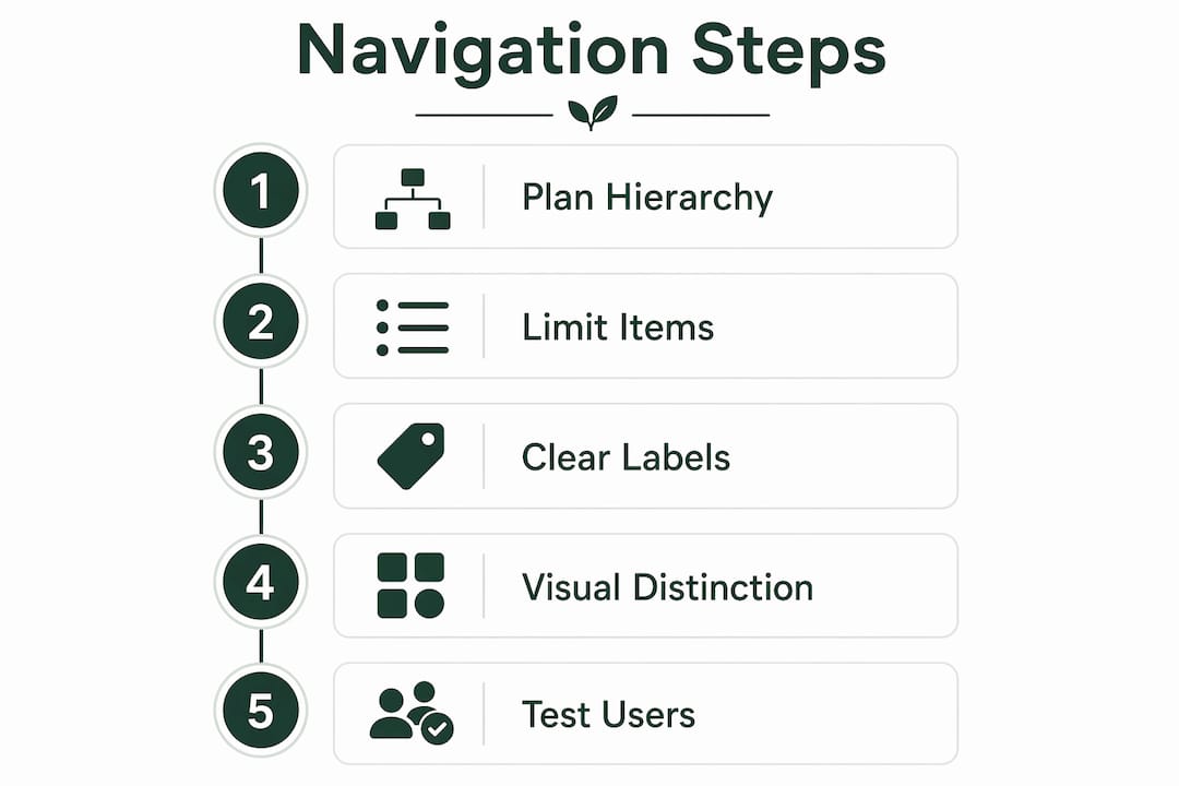
How do you plan and organize your website navigation step by step?
Planning before you build saves hours of rework. Follow these steps in order.
- List every page your site needs. Write them all down, from Home and About to individual service or product pages. Do not filter yet.
- Run a card sort. Write each page name on a card (physical or digital) and ask 5–10 real users to group them logically. Card sorting reveals how your visitors think, not how you think. Their groupings often differ sharply from your internal categories.
- Draw a site hierarchy diagram. Map your pages into a tree structure before touching any design tool. This step prevents deep, tangled navigation that hurts both users and SEO.
- Group by user task, not company structure. Visitors want to solve a problem or find information. They do not care about your internal departments. Organize pages around what visitors want to do.
- Choose your menu type for each device. A horizontal bar works well on desktop. A collapsible hamburger menu works on mobile. Decide this before you build.
- Limit submenu levels to two. A top-level item can have one dropdown level beneath it. Going deeper than that creates confusion and is hard to use on mobile.
Pro Tip: Sketch your hierarchy on paper first. A simple whiteboard diagram catches structural problems before they become coded mistakes.
Here is a quick reference for matching site size to menu depth:
| Site size | Recommended top-level items | Max submenu levels |
|---|---|---|
| 1–10 pages | 3–5 | 0 |
| 11–30 pages | 5–7 | 1 |
| 31+ pages | 5–7 | 2 |
The table above shows that even large sites should cap top-level items at seven. The depth increases, but the top menu stays clean.
What are the common navigation menu types and when to use them?
Choosing the right menu type depends on your content volume and your visitors' devices.
Horizontal navigation bar. This is the standard for desktop sites with fewer than eight top-level pages. It sits at the top of every page, stays visible, and matches what most visitors expect. Standard navigation patterns like this reduce cognitive load because visitors already know how to use them.
Mega menu. A mega menu expands into a large panel showing multiple categories and links at once. Use it only when you have a large content catalog, such as an e-commerce store with dozens of product categories. Keep mega menus to two levels of depth to avoid overwhelming visitors.
Sidebar navigation. Sidebars work best for documentation sites, dashboards, and resource libraries where visitors need to move between many related pages quickly. They are less common on small business sites but very effective for content-heavy sections.
Hamburger menu. The three-line icon that collapses your full menu is the standard for mobile. Use it on every mobile version of your site. A collapsible hamburger menu keeps the screen clean while keeping all navigation accessible behind one tap.
A few rules apply across all menu types:
- Never nest dropdowns more than two levels deep.
- Always include a visible "active state" so visitors know which page they are on.
- Keep touch targets on mobile at least 44x44 pixels so links are easy to tap.
How do you avoid common navigation mistakes?
Most navigation problems fall into a short list of repeating errors. Knowing them in advance saves you from building a site that frustrates visitors.
Menu overload. Adding every page to the main menu feels thorough but creates clutter. Stick to the 5–7 item limit and move secondary pages to footer links or internal page links.
Unclear or clever labels. Labels like "Solutions," "Resources," or "The Hub" sound interesting but tell visitors nothing. Use words that describe exactly what is behind the link.
Inconsistent placement. Moving the menu between pages, or changing its style on certain sections, breaks the mental map visitors build as they browse. Consistent navigation placement across all pages is a recognized usability standard, not just a preference.
Deep nesting. Navigation beyond two submenu levels is hard to use on any device. It also makes it harder for search engines to crawl your deeper pages.
No mobile optimization. A desktop menu that does not adapt to small screens forces visitors to pinch, zoom, and guess. Test your navigation on a real phone, not just a browser simulator.
Refining navigation is not a one-time task. User testing and Google Analytics data identify real pain points that no amount of planning can predict. Review your navigation every time you add new pages or see a spike in bounce rates.
Pro Tip: Check your Google Analytics "Behavior Flow" report. If visitors consistently drop off after the same page, your navigation may be sending them to a dead end.
Navigation also needs to reflect what your visitors actually want. Prioritizing the top pages visitors seek based on analytics data improves both relevance and conversion. Put your most visited pages in the most visible spots.
Key Takeaways
A clear, shallow, and consistently placed navigation menu is the single most important structural decision you make when building a website.
| Point | Details |
|---|---|
| Limit top-level items | Keep your main menu to 5–7 items to prevent decision fatigue. |
| Maintain shallow depth | Any page should be reachable in three clicks or fewer from the homepage. |
| Plan before you build | Use card sorting and a site hierarchy diagram before touching any design tool. |
| Match menu type to device | Use a horizontal bar on desktop and a hamburger menu on mobile. |
| Test and refine | Use Google Analytics behavior data to find and fix navigation problems after launch. |
Why I stopped overthinking navigation and started testing it instead
The biggest mistake I see beginners make is spending weeks debating menu labels and hierarchy in a vacuum. You can read every best practice guide available, including this one, and still build navigation that confuses your actual visitors. The only thing that closes that gap is putting real people in front of your site early.
My honest observation: most small business owners build navigation that reflects how they think about their own business, not how a stranger thinks about finding a solution to their problem. Card sorting feels like extra work, but it consistently reveals gaps that no amount of internal debate would catch.
Starting simple also matters more than most guides admit. A five-item horizontal menu with plain labels outperforms a beautifully designed mega menu with clever category names every time. Complexity is easy to add later. Simplicity is hard to recover once you have built in layers of structure.
Accessibility standards like the W3C WAI guidelines are worth following even if you think your audience does not include people with disabilities. The same visual clarity that helps a user with a cognitive disability also helps a tired visitor scanning your site on a phone at 11 PM. Good structure serves everyone.
Build the simplest navigation that covers your top five visitor goals. Launch it. Then let real behavior data tell you what to change. That cycle beats any amount of upfront planning.
— jacopo
How Talivo builds your navigation structure automatically
Building a site from scratch means making dozens of small decisions before a single visitor arrives. Navigation structure is one of the hardest because it requires you to think like your visitors, not like yourself.
Talivo handles that process with AI. Paste your existing URL and Talivo rebuilds your site with a modern, mobile-first layout that follows 2026 navigation best practices automatically. If you have a Google Maps listing but no website, Talivo converts it directly into a full site, complete with photos, reviews, and a clean menu structure. New businesses can describe what they do and get a complete site generated in minutes. See how Talivo works to understand the full process, or start building your site today without writing a single line of code.
FAQ
What is the ideal number of items in a website menu?
The ideal main menu has 5–7 items, based on Miller's Law, which identifies 7 (plus or minus 2) as the optimal number for human working memory. More items increase decision fatigue and slow visitors down.
How deep should my website navigation go?
Any page should be reachable within three clicks from the homepage. Nesting beyond two submenu levels reduces usability and makes it harder for search engines to crawl your content.
What is a hamburger menu and when should I use it?
A hamburger menu is a collapsible navigation icon, typically three horizontal lines, used on mobile devices to hide the full menu behind a single tap. Use it on every mobile version of your site to keep the screen clean.
How do I know if my navigation is working?
Check Google Analytics "Behavior Flow" and bounce rate data by page. High drop-off rates after specific pages often signal that visitors cannot find what they need next. User testing with real visitors confirms the problem faster than any metric alone.
Should I organize my menu around my business structure?
No. Organize your menu around what visitors want to do or find, not around your internal departments or service categories. Card sorting with 5–10 real users reveals the groupings that match visitor expectations.