
A website design consistency audit is a systematic review of a site's visual and interaction elements to confirm they align uniformly with brand standards and deliver a predictable user experience. The industry term for this practice is a UI consistency audit, though "design consistency audit" is the phrase most designers and marketers search for. Consistency audits are core pillars of website health alongside usability, SEO, and technical performance. When visual language, component behavior, and content tone all pull in the same direction, users trust the product faster and stay longer. For web designers, developers, and digital marketers, running this audit is not optional maintenance. It is the foundation of a scalable, credible digital product.
What is a website design consistency audit?
A website design consistency audit is a structured evaluation that checks every visual and functional element of a site against a defined set of brand guidelines. Audits review visual language elements to ensure a unified experience across every page and device. The goal is to surface gaps before users notice them, not after bounce rates climb.
The audit sits at the intersection of brand governance and UX quality control. A site built over several years by multiple teams almost always accumulates inconsistencies. Button styles drift. Typography scales multiply. Color values diverge from the approved palette. Each individual change seems minor, but the combined effect erodes user trust and brand credibility.

Design consistency audits are distinct from general website audits. A general audit covers SEO, page speed, and broken links. A consistency audit goes deeper into the visual and interaction layer, asking whether every element follows the same rules. Both types of audits belong in a healthy website maintenance cycle, but they answer different questions.
What elements are evaluated in a design consistency audit?
A thorough audit covers four layers: visual, functional, content, and technical. Skipping any one of them produces an incomplete picture.
Visual elements form the most visible layer:
- Color palettes: every hex value checked against the brand color system
- Typography: font families, weights, sizes, and line heights across headings, body text, and labels
- Iconography: consistent icon style, size, and stroke weight across the site
- Spacing: margin and padding values aligned to a defined grid or spacing scale
- Imagery: photo style, aspect ratios, and treatment filters applied uniformly
Functional elements govern how the site behaves:
- Button states: hover, active, disabled, and focus states consistent across all CTAs
- Navigation patterns: menu structure, breadcrumb behavior, and link styling uniform across pages
- Animation and motion: transition speeds and easing curves applied consistently, not ad hoc
Content consistency is the layer most audits miss. Inconsistent terminology or behavior creates cognitive overload and user hesitation. If one page calls an action "Sign Up" and another calls it "Register," users pause. That pause costs conversions. Tone, label naming, and call-to-action phrasing all belong in the audit scope.
Technical and accessibility overlaps round out the review. Color contrast ratios, focus indicators, and ARIA label consistency all affect both accessibility compliance and visual coherence. Common accessibility oversights often surface during consistency audits because the two disciplines share the same underlying design decisions.
A design system with tokens for colors, spacing, and typography acts as a single source of truth. Updating a token propagates changes across the entire product without manual fixes. Teams that audit against a token-based system catch inconsistencies faster and resolve them at the system level rather than page by page.
How to conduct a website design consistency audit
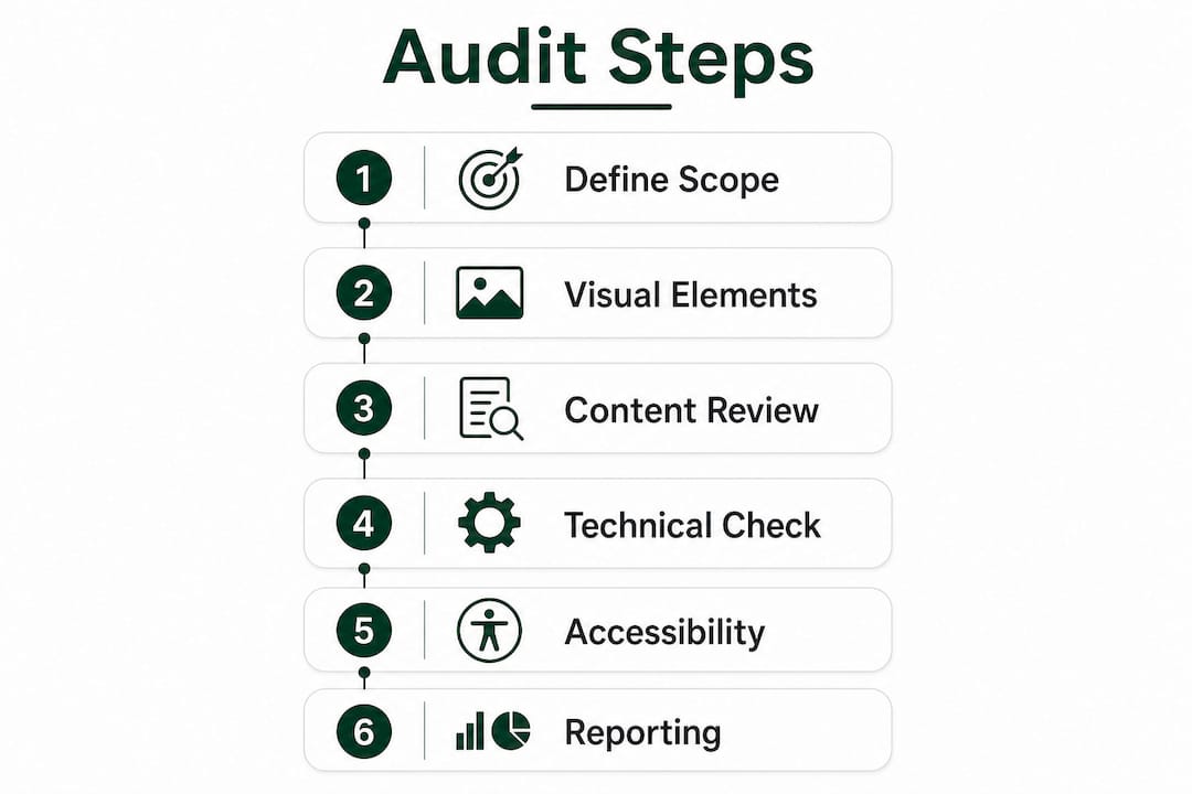
Audits follow six primary stages: goal definition, baseline metric gathering, usability assessment, visual consistency check, technical and accessibility compliance, and a prioritized action plan. The depth of each stage depends on the audit type: a heuristic review takes hours, while a comprehensive 12-step deep dive takes days.
- Define clear goals. Decide what the audit must answer before opening a single page. Are you preparing for a rebrand? Investigating high bounce rates? Onboarding a new design system? Goals shape scope.
- Gather baseline metrics. Pull Core Web Vitals, heatmap data, and session recordings. Quantitative data reveals where users struggle before the visual review begins.
- Run a usability assessment. Walk through key user flows as a first-time visitor. Note every point of friction, confusion, or inconsistency in navigation and interaction patterns. Reviewing non-mobile menu behavior is a common starting point for this stage.
- Conduct the visual consistency check. Screenshot every unique page template. Compare color values, type styles, spacing, and component variants side by side. A spreadsheet or design audit tool works for this step.
- Check technical and accessibility compliance. Run automated contrast checkers and keyboard navigation tests. Flag any element that fails WCAG 2.1 AA standards.
- Build a prioritized action plan. Group findings by severity: critical (breaks trust or accessibility), moderate (degrades experience), and minor (cosmetic). Assign ownership and deadlines before the audit document leaves the room.
Pro Tip: Document every inconsistency with a screenshot, the page URL, and the expected standard. Vague audit notes like "buttons look off" create rework. Specific notes like "CTA button on /pricing uses #E03A3A instead of brand red #D62B2B" get fixed on the first pass.
A successful audit integrates clear goals, data-driven reviews, and governance to produce measurable improvements. Teams that skip goal definition end up with a list of cosmetic fixes and no clear business impact to show stakeholders.
Why design consistency matters for users and business outcomes
Consistent interfaces reduce cognitive load, decrease error rates, and boost user retention by enabling predictable, familiar user journeys. That is not a soft UX principle. It is a measurable business outcome. Inconsistent UI increases user anxiety, raises bounce rates, and signals a lack of professionalism to first-time visitors.
"Design consistency is 'trust architecture.' It is a strategic infrastructure essential for building scalable products without creating fragmented, Frankenstein UIs where every new feature looks like it arrived from a different product team."
Tubik Studio
The business case for consistency extends beyond user satisfaction:
- Reduced development time: Shared components and tokens mean developers build once and reuse everywhere. One-off fixes disappear.
- Lower error rates: Predictable patterns mean users make fewer mistakes, which reduces support volume.
- Faster onboarding: New team members learn one design system, not a collection of exceptions.
- Stronger brand recall: Users who encounter a consistent visual language across every touchpoint remember the brand more accurately.
Inconsistency imposes a cognitive tax on users, increasing mental effort that directly reduces conversion rates and satisfaction scores. A site that makes users think about how to use it is a site that loses them to a competitor who does not. Reviewing outdated design patterns is one of the fastest ways to identify where this cognitive tax is highest on an existing site.
Spacing and whitespace deserve specific attention here. Whitespace applied consistently across page templates signals visual hierarchy and reduces visual noise. Sites that treat spacing as an afterthought look cluttered even when the content is strong.
Common pitfalls in website design consistency audits
Most audit failures share the same root cause: teams treat the audit as a one-time cleanup rather than a governance process. Surface-level reviews without clear goals produce a list of cosmetic patches, not systemic improvements.
The most common mistakes are:
- Fixing symptoms, not systems. Changing a button color on one page without updating the shared component means the same inconsistency reappears on the next release.
- Ignoring content and interaction layers. Visual audits that skip terminology, motion, and behavioral patterns miss half the consistency picture.
- No governance after the audit. Without a named owner for the design system, inconsistencies return within months. Design system decay is the predictable result of audits without follow-through.
- Skipping accessibility checks. Accessibility and visual consistency share the same design decisions. Auditing one without the other creates blind spots.
- No measurable success criteria. An audit that does not define what "done" looks like cannot demonstrate ROI to stakeholders.
Pro Tip: Assign a design system owner before the audit ends. This person reviews all new components against established standards before they ship. Without this role, the next audit will find the same problems.
AI-powered tools assist in detecting inconsistencies in design, messaging, and brand assets at a scale no manual review can match. They free designers to focus on judgment calls while automation handles pattern detection across hundreds of pages.
Key Takeaways
A website design consistency audit is the most direct way to close the gap between how a brand intends to appear and how users actually experience it.
| Point | Details |
|---|---|
| Define the audit scope first | Set clear business goals before reviewing a single page to avoid cosmetic-only fixes. |
| Audit all four layers | Visual, functional, content, and technical consistency each affect user trust independently. |
| Use a token-based design system | Tokens let teams update colors, spacing, and type globally without manual page-by-page fixes. |
| Assign governance after the audit | A named design system owner prevents inconsistencies from returning within the next release cycle. |
| Treat audits as ongoing maintenance | Periodic reviews prevent brand erosion and UX degradation far better than one-time cleanups. |
The audit habit most teams skip
The most underrated part of a design consistency audit is what happens after the report is filed. Teams invest days in a thorough review, produce a detailed findings document, and then distribute it to a group with no clear owner. Six months later, the same inconsistencies are back, plus a few new ones from the features shipped in between.
I have seen this pattern repeat across teams of every size. The audit itself is not the hard part. The hard part is building the governance habit that makes the audit's findings stick. A living design system with a named steward and a clear review process for new components changes everything. It turns a one-time cleanup into a continuous quality standard.
The other mistake I see consistently is treating the visual layer as the whole audit. Color and typography are easy to screenshot and compare. But the audits that actually move business metrics are the ones that go after content consistency, interaction patterns, and accessibility in the same pass. Those layers are harder to document, but they are where the real cognitive tax on users lives.
My honest recommendation: run your first audit as a full four-layer review, even if it takes longer. The findings from that first pass will tell you exactly where to focus your governance energy going forward. Every subsequent audit gets faster because the system is doing more of the work.
— jacopo
How Talivo supports consistent, audit-ready websites
Building a site that passes a design consistency audit starts with a solid foundation. Talivo builds websites with AI from the ground up, applying consistent visual standards, mobile-first layouts, and coherent component structures from the first page to the last.
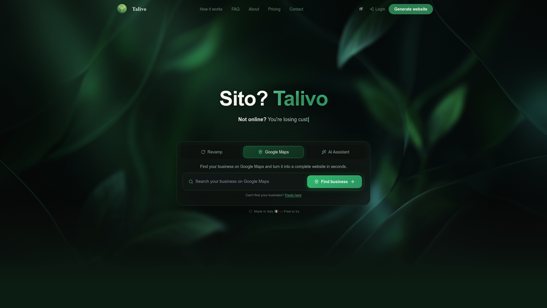
For teams with an existing site that has accumulated years of inconsistency, Talivo can take the current URL and rebuild it with a modern, unified design while retaining all content and images. The result is a site that is easier to audit, easier to maintain, and far less likely to impose a cognitive tax on visitors. Explore what AI-powered website building looks like in practice, or see the full workflow at how Talivo works.
FAQ
What is a website design consistency audit?
A website design consistency audit is a structured review of a site's visual, functional, content, and technical elements to confirm they align with brand guidelines and deliver a predictable user experience. It identifies gaps that erode user trust and brand credibility before they affect business metrics.
How often should you run a design consistency audit?
Periodic audits prevent UX degradation and brand erosion better than one-time reviews. Most teams benefit from a lightweight audit after every major release and a full audit annually or before a rebrand.
What is the difference between a design audit and a usability audit?
A design audit checks whether visual and interaction elements follow consistent standards across the site. A usability audit evaluates whether users can complete tasks efficiently. Both are components of a complete website health review, but they answer different questions.
Why does design consistency affect conversion rates?
Inconsistent interfaces impose a cognitive tax on users, increasing mental effort and reducing confidence in the product. Higher cognitive load correlates directly with higher bounce rates and lower conversion rates.
What is a design token and why does it matter for audits?
A design token is a named variable that stores a design decision, such as a color value or spacing unit, and applies it across an entire product. Auditing against a token system means one fix propagates everywhere, preventing the same inconsistency from recurring on the next release.