
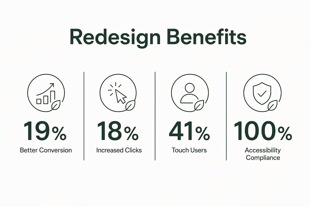
Outdated desktop navigation is one of the most overlooked conversion killers on the web. The case for why non-mobile menus need redesigning comes down to three hard facts: hidden menus reduce discoverability, hover-only interactions fail on modern devices, and accessibility standards like WCAG 2.2 now flag legacy patterns as critical failures. The Nielsen Norman Group confirms that hamburger menus cut discoverability by 21% compared to visible navigation. Websites that show primary nav items openly convert 19% better than those hiding links behind icons. If your desktop site still relies on hover triggers or a hamburger drawer, the data says you are losing users before they even start.
Why non-mobile menus need redesigning: the usability case
Legacy desktop menus were built around one assumption: every user has a mouse. That assumption is now wrong. 41% of B2B devices now use touch or hybrid input modes, up from 28% in 2024. A hover-triggered mega menu simply does not fire on a touchscreen, so a large share of your visitors hits a dead end the moment they try to navigate.
The problems go beyond touch devices. Hover-only menus also fail users with motor impairments, who cannot hold a cursor steady long enough to trigger a submenu. They fail screen reader users because the interaction model does not translate to keyboard navigation. These are not edge cases. They are the exact patterns that WCAG 2.2 Success Criterion 2.5.7 flags as critical accessibility failures in professional audits.

The hamburger icon on desktop creates a separate problem. It hides navigation behind an icon that many users, especially older or less tech-savvy visitors, do not recognize as a menu trigger. Hidden navigation creates what UX researchers call "invisible friction." Users must first learn that a menu exists, then tap to reveal it, then scan its contents. That extra cognitive step costs you engagement before a single page loads.
Key patterns that signal a menu needs redesigning:
- Hover-only submenus with no click fallback
- Hamburger icons used as the primary nav trigger on desktop
- Icon-only buttons with no text labels (only 64% of users prefer labeled buttons, meaning icon-only designs fail the rest)
- Navigation buried in a drawer that requires two or more taps to reach
- No keyboard focus management or visible focus indicators
What are the real benefits of redesigning desktop menus?
Visible navigation outperforms hidden navigation on every metric that matters. Sites that moved primary links out of hamburger drawers and into a sticky top bar saw time to first navigation interaction drop from 38 seconds to 11 seconds. That is not a minor improvement. It means users find what they need three times faster, which directly reduces bounce rates and increases the chance of conversion.
Click-triggered disclosure menus replace hover triggers and deliver measurable gains. Click-triggered menus show 18% higher task success and 11% shorter task times compared to hover-triggered menus. The reason is simple: a click is an intentional action that works across every input device, from a mouse to a finger to a keyboard press.
The accessibility benefits compound the usability gains. Click-triggered menus built with proper ARIA roles and focus management satisfy WCAG 2.2 requirements. That protects you legally and opens your site to users who rely on assistive technology. The adoption rate confirms the shift: 76% of redesigned B2B navigation systems now use click-triggered disclosure, up from 41% in 2024.
Pro Tip: Ship the same click-triggered navigation pattern on both desktop and mobile. A unified pattern reduces code complexity by roughly 30% and keeps the user experience consistent across every screen size.
Additional benefits of a well-executed menu redesign:
- Higher conversion rates from improved discoverability
- Lower development overhead from a unified nav component
- Reduced accessibility audit failures
- Faster navigation times across all device types
- Stronger compliance with WCAG 2.2 standards
How do you audit and consolidate a complex desktop navigation?
Start with an inventory. Pull every link currently in your primary navigation and measure its engagement using your analytics platform. Most sites carry links that receive under 2% of all nav clicks. Those links do not belong in the primary bar.
Once you have the data, apply a simple prioritization rule. Keep 3–5 high-engagement links visible by default in the top bar. Group the remaining links under a clearly labeled "More" button, not a hamburger icon. A text label like "More" tells users exactly what to expect. A three-line icon tells them nothing.
Follow this sequence when consolidating your navigation:
- Export all primary nav links and their click-through rates from your analytics tool.
- Rank links by engagement and identify the top 3–5 performers.
- Move low-engagement links to a labeled expandable menu or to the footer.
- Audit secondary navigation items. Move post-decision links (legal, careers, privacy) to the footer. Footer link visibility increased click-through by 31% in sites that made this shift.
- Run a usability test with 5 representative users before finalizing the structure.
Objections to visible navigation often trace back to poor information architecture, not a genuine need for hidden menus. When you consolidate to fewer, high-engagement links, the menu feels cleaner and users find their destination faster. Hiding links is rarely the solution. Reducing the number of links is.
Pro Tip: Use a card-sorting exercise with real users before your redesign. Ask them to group your current nav items into categories. The results will tell you exactly how many top-level items your audience expects and how they mentally organize your content.
What accessibility and device standards apply to desktop menus?
WCAG 2.2 is the governing standard for web accessibility in 2026, and it has direct implications for non-mobile menu user experience. Success Criterion 2.5.7 specifically targets pointer cancellation and hover interactions. Any menu that activates on hover without a click-based alternative fails this criterion.
Keyboard accessibility is equally non-negotiable. Every menu item must be reachable via the Tab key. Every submenu must open and close with Enter or Escape. Focus must move logically through the menu and return to the trigger when the submenu closes. These behaviors require explicit ARIA roles: role="navigation", aria-expanded, and aria-controls on the trigger button.
Touch and hybrid devices add another layer of complexity. A laptop with a touchscreen, like many Windows devices, can switch between mouse and touch input mid-session. Your menu must handle both without breaking. The only reliable way to achieve this is a click-triggered pattern with no hover dependency.
| Input type | Hover-only menu | Click-triggered menu |
|---|---|---|
| Mouse | Works | Works |
| Touchscreen | Fails | Works |
| Keyboard only | Fails | Works (with ARIA) |
| Screen reader | Fails | Works (with ARIA) |
| Hybrid (touch + mouse) | Unreliable | Works |
Testing across input modes is not optional. Run your redesigned menu through a keyboard-only session, a screen reader session using NVDA or VoiceOver, and a touch-only session on a Windows hybrid device before launch.
What do modern non-mobile menu patterns look like in practice?
The sticky top bar is the most widely adopted pattern for desktop navigation. It keeps 3–5 primary links permanently visible as the user scrolls. A secondary "More" dropdown handles overflow. This pattern works for most business sites because it requires no learning curve and works identically on mouse, keyboard, and touch.
The bottom tab bar is gaining ground in B2B SaaS products. 38% of the top 1,000 B2B SaaS mobile sites use bottom bar navigation in 2026. Some teams are now applying the same pattern to desktop web apps where users spend long sessions, because it keeps primary actions within thumb reach on hybrid devices and reduces eye travel.
Horizontal scroll navigation suits brands with more than five primary actions. The nav bar shows the first four or five items, and users swipe or scroll to reveal more. This pattern works well for e-commerce and media sites with deep category structures. It avoids the clutter of a mega menu while keeping all options accessible.
Pro Tip: Move legal, careers, and support links to the footer. These are post-decision links that users seek out intentionally. Keeping them in the primary nav adds clutter without adding value. Freeing that space lets your core links breathe.
For sites with outdated navigation systems, the fastest path to improvement is often a two-step approach: first consolidate the link inventory, then apply one of these three patterns based on the number of primary actions your site requires.
Key Takeaways
Redesigning non-mobile menus from hover-only or hidden patterns to visible, click-triggered navigation is the single most effective change a web designer or small business owner can make to improve usability and conversion in 2026.
| Point | Details |
|---|---|
| Visible nav converts better | Sites with visible primary links convert 19% better than those using hamburger menus. |
| Click-triggered menus outperform hover | Click-triggered patterns deliver 18% higher task success and 11% shorter task times. |
| WCAG 2.2 compliance is required | Hover-only menus fail WCAG 2.2 Success Criterion 2.5.7 and must be replaced. |
| Consolidate before redesigning | Audit link engagement and keep only 3–5 primary items visible by default. |
| Unified patterns reduce complexity | One click-triggered nav component for desktop and mobile cuts code complexity by roughly 30%. |
The uncomfortable truth about desktop menu design
I have run usability tests on dozens of business websites, and the pattern is always the same. The designer chose a hamburger menu or a hover mega menu because it looked clean in the mockup. The client approved it because it looked modern. Nobody tested it with real users on a hybrid laptop or with keyboard-only navigation.
The uncomfortable truth is that hidden menus are a convenience for designers, not for users. They keep the visual layout tidy at the cost of discoverability. When I watch a first-time visitor land on a site with a hamburger icon as the only nav trigger, I see them pause, look around, and sometimes leave without ever clicking it. That pause is invisible in your analytics. It does not show up as a bounce. It shows up as a low conversion rate that nobody can explain.
The business case for redesigning navigation is stronger than most teams realize. A 19% conversion lift from visible navigation is not a UX vanity metric. On a site generating $50,000 a month, that number is material. The development cost of switching to a click-triggered sticky bar is typically one to three days of work. The return on that investment is immediate and measurable.
My advice is to stop treating navigation as a design problem and start treating it as a revenue problem. Audit your current menu, run a five-person usability test, and look at your analytics. The data will tell you exactly where users are getting stuck. Then fix it with the simplest pattern that works across every device and input mode.
— jacopo
Talivo makes modern navigation part of every site it builds
Getting navigation right from the start is far easier than fixing it after launch. Talivo builds websites with AI, and every site it generates follows current best practices for visible, click-triggered navigation that works across desktop, tablet, and mobile without extra configuration.
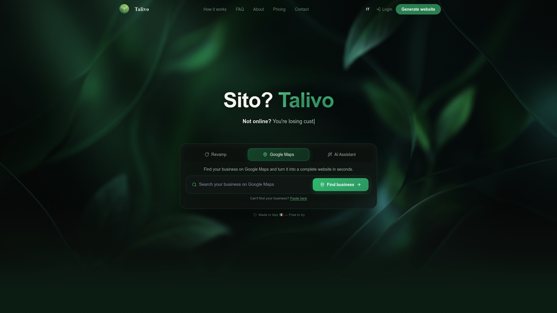
If you have an existing site with outdated menus, paste your URL into Talivo and it will redesign your site with a modern, mobile-first structure while keeping your content and images intact. For businesses starting from scratch, Talivo's AI walks you through the process step by step. See how Talivo works to understand how quickly a properly structured site can go live.
FAQ
Why do hamburger menus hurt desktop conversion rates?
Hamburger menus reduce navigation discoverability by 21%, according to the Nielsen Norman Group. Users who cannot find the menu quickly tend to leave rather than search for it.
What is WCAG 2.2 Success Criterion 2.5.7?
WCAG 2.2 Success Criterion 2.5.7 requires that interactions triggered by pointer motion, including hover, have a click-based alternative. Hover-only menus fail this criterion and are flagged in professional accessibility audits.
How many links should a desktop primary navigation show?
Keep 3–5 high-engagement links visible by default. Group remaining links under a clearly labeled "More" button and move post-decision links like legal and careers to the footer.
When should a site use a bottom tab bar instead of a top nav?
Bottom tab bars work best for web apps where users spend long sessions and need quick access to primary actions. They are used by 38% of the top 1,000 B2B SaaS mobile sites and are increasingly applied to desktop app interfaces.
Does redesigning navigation actually improve conversion?
Sites that replaced hidden hamburger menus with visible primary navigation converted 19% better. Time to first navigation interaction also dropped from 38 seconds to 11 seconds after the redesign.