
Freelance website mobile optimization is the practice of designing and adjusting your site so mobile visitors get fast load times, clear navigation, and accessible calls to action. More than 50% of global web traffic is mobile. That number means a potential client is more likely to view your portfolio on a phone than a desktop. Google's mobile-first indexing and Core Web Vitals standards reinforce this reality by ranking sites based on their mobile experience first. Getting this right is not optional for freelancers who want to win clients online.
What are the key prerequisites for freelance website mobile optimization?
Before making any changes, run a mobile-friendly audit. Open your site on a real phone and note every point where you hesitate, squint, or tap the wrong button. That friction is costing you clients. Most mobile issues can be fixed within 1–2 weeks by targeting specific problems rather than rebuilding from scratch.
Your platform choice determines how much control you have over mobile behavior. Platforms like Duda suit freelancers managing multiple client sites with white-label needs, while Wix and Squarespace work well for individual freelancers who want design flexibility without writing code. Choosing the right platform early prevents disruptive rebuilds later. If your current platform fights you on every mobile tweak, that is a signal to switch before investing more time.
Here is what to confirm before you start fixing anything:
- Your site passes Google's Mobile-Friendly Test (search "Google Mobile-Friendly Test" to access the free tool)
- Images are served in modern formats like WebP rather than uncompressed JPEGs
- Your CMS or website builder supports responsive templates natively
- Tap targets (buttons and links) are at least 44x44 pixels per Apple's Human Interface Guidelines
- Your contact form works on a touchscreen without zooming
Pro Tip: Run your audit on both iOS Safari and Android Chrome. These two browsers render pages differently, and a layout that looks fine on one can break on the other.
How do you apply responsive design principles to a freelance website?
Responsive design is the technical standard that makes a single website adapt to any screen size automatically. The industry term is "responsive web design," coined by Ethan Marcotte in 2010, and it remains the foundation of every mobile-first build today.

Fluid grids using relative units like percentages adapt to any viewport width, while fixed pixel widths create cramped, broken layouts on small screens. The practical difference is significant. A column set to 50% always takes up half the screen. A column set to 600 pixels overflows a 375-pixel-wide phone screen entirely.
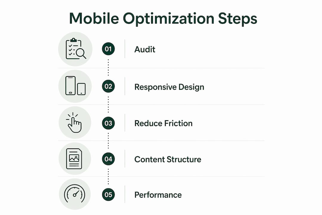
The mobile-first approach means you design for the smallest screen first, then scale up. This forces you to prioritize what actually matters. On a phone, you have roughly 375 pixels of width and a visitor who will leave in seconds if they cannot find what they need. Start with your headline, your service summary, and your contact button. Add complexity only as screen size increases.
Key responsive design techniques for freelancers:
- Use CSS
max-widthon containers to prevent content from stretching too wide on large screens - Use CSS
min-widthmedia queries to add layout complexity only on larger viewports - Replace fixed navigation bars with hamburger menus on screens below 768 pixels wide
- Use sticky headers sparingly. Navigation should stay short and clear, and a sticky header that takes up 20% of a phone screen buries your content
- Set font sizes with
remunits rather than pixels so text scales with user preferences
Pro Tip: Test your layout at 320 pixels wide, not just 375. Older Android phones and some budget devices still use that viewport width, and a layout that breaks there will cost you clients.
Whitespace plays a bigger role on mobile than most freelancers realize. Tight spacing between elements forces misclicks and frustrates visitors. The role of whitespace in web design is especially pronounced on small screens, where breathing room between sections directly affects how readable and trustworthy your site feels.
What specific steps reduce friction and improve mobile performance?
Mobile optimization is a conversion-focused strategy, not a cosmetic one. The goal is removing every obstacle between a visitor and the action you want them to take, whether that is booking a call, sending an inquiry, or downloading your rate card.
Most friction problems are specific and fixable, not structural. Slow hero images, tiny tap targets, and multi-field contact forms cause the majority of mobile drop-offs. You do not need a full redesign to fix them.
Follow this sequence:
- Compress every image. Use a tool like Squoosh or TinyPNG to reduce file sizes before uploading. A hero image above 200KB will noticeably slow your page on a mobile connection.
- Check tap target size. Every button, link, and menu item needs enough space for a thumb. Cramped targets cause misclicks, and misclicks cause exits.
- Simplify your contact form. Cut every field that is not strictly necessary. Name, email, and a message field are enough. Each extra field reduces completion rates.
- Make your primary CTA visible without scrolling. A visitor should see your main call to action the moment your page loads on a phone. If they have to scroll to find it, many will not.
- Test page speed with Google PageSpeed Insights. The tool gives you a mobile score and flags specific issues ranked by impact.
The single most common mistake freelancers make is treating mobile as an afterthought. They build a beautiful desktop site, then check how it looks on a phone as the last step. By then, the layout decisions are baked in and expensive to undo. Build mobile first, and the desktop version almost always falls into place naturally.
Avoid outdated website features like full-screen pop-ups, auto-playing video with sound, and Flash-era animations. These hurt mobile performance and signal to visitors that your site has not been maintained.
How should freelancers structure content and portfolio layouts for mobile?
Content hierarchy on mobile is different from desktop. Visitors scan, not read. They decide within seconds whether to stay or leave. Front-loading key information within the first visible screen area is the single most effective content strategy for mobile freelance sites. On Upwork, for example, profile titles get truncated after 35 characters on mobile. The same principle applies to your own site's headlines and service descriptions.
Structure your portfolio and service pages with these priorities:
- Lead with your specialty and the result you deliver, not your name or a generic welcome message
- Use single-column layouts for portfolio grids on mobile. Two columns work on tablets, but one column reads cleanly on phones
- Write headings that communicate value in six words or fewer. "Brand Identity Design for Tech Startups" beats "Welcome to My Portfolio"
- Place your strongest portfolio samples first. Mobile visitors rarely scroll to the bottom of a long gallery
- Balance image quality with file size. A portfolio image should look sharp at 375 pixels wide and weigh under 150KB
A single-column layout does more than improve readability. It eliminates the risk of images and text overlapping when a visitor rotates their phone or uses a non-standard browser. The role of mobile view on a freelancer website extends beyond aesthetics. It directly shapes whether a potential client trusts your professionalism enough to reach out.
Pro Tip: Screenshot your own homepage on a phone and send it to a friend who does not know your work. Ask them what you do and how to contact you. If they cannot answer both questions in 10 seconds, your mobile content hierarchy needs work.
Key Takeaways
Mobile-first design is the most reliable path to better client engagement and higher conversion rates for freelancers and small business owners.
| Point | Details |
|---|---|
| Start with a mobile audit | Identify friction points on real devices before making any design changes. |
| Choose the right platform | Platforms with native responsive support prevent costly rebuilds down the line. |
| Use fluid grids and relative units | Percentage-based layouts adapt to any screen size without breaking. |
| Fix friction before redesigning | Slow images, small tap targets, and long forms cause most mobile drop-offs. |
| Front-load critical content | Place your specialty, value statement, and CTA within the first visible screen area. |
What I have learned from watching freelancers get mobile wrong
The most common mistake I see is not technical. It is a mindset problem. Freelancers treat mobile optimization as a one-time checkbox rather than an ongoing practice. They fix the obvious issues after a redesign, then leave the site untouched for two years while their audience shifts further toward mobile-only browsing.
The second mistake is chasing perfection on desktop while tolerating "good enough" on mobile. A beautifully crafted desktop portfolio with a broken mobile layout sends exactly the wrong signal to a potential client. It says you do not pay attention to how your work actually gets used.
What actually works is incremental improvement. Pick one friction point per week. Fix the hero image load time this week. Simplify the contact form next week. Adjust the CTA button size the week after. Small, consistent changes compound into a site that converts reliably. A full redesign is rarely necessary, and the AI-assisted website creation tools available now make targeted improvements faster than ever.
The freelancers I have seen gain the most from mobile optimization are not the ones who spent the most money. They are the ones who tested their own site on a phone regularly, noticed what felt broken, and fixed it. That habit is worth more than any single design overhaul.
— jacopo
How Talivo helps freelancers build mobile-ready websites fast
Freelancers who want a mobile-first site without months of back-and-forth with developers have a practical option in Talivo. The platform builds professional, mobile-ready websites in minutes using AI, whether you are starting from scratch, converting a Google Maps listing, or refreshing an outdated site.
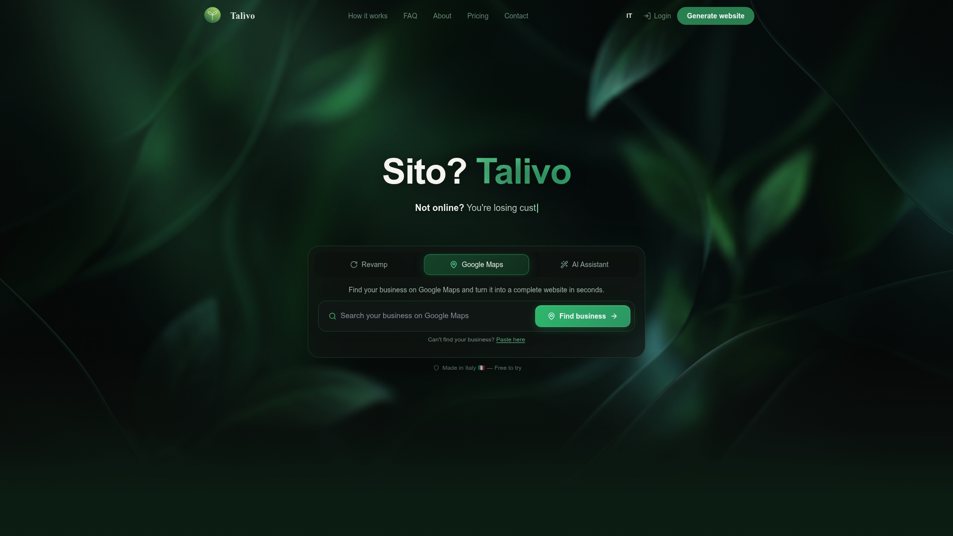
Paste your existing URL and Talivo redesigns it with a modern, mobile-first layout while keeping your content and images intact. For freelancers managing multiple projects, that speed matters. You can see how Talivo works and get a mobile-optimized site live without writing a single line of code. If you are ready to stop losing mobile visitors, build your site with Talivo and start with a foundation that works on every screen.
FAQ
What is freelance website mobile optimization?
Freelance website mobile optimization is the process of designing and adjusting your site so mobile visitors experience fast load times, clear navigation, and accessible calls to action. It covers responsive layout, image compression, tap target sizing, and content hierarchy.
How long does it take to fix mobile issues on a freelance site?
Most mobile issues can be resolved within 1–2 weeks by targeting specific friction points like slow images, small buttons, and complex forms rather than rebuilding the entire site.
Which platform is best for mobile-friendly freelance sites?
Duda suits freelancers managing multiple client sites, while Wix and Squarespace work well for individual freelancers who want design flexibility. The best choice depends on whether you manage one site or many.
Does mobile optimization affect SEO for freelancers?
Yes. Google uses mobile-first indexing, meaning it ranks your site based on its mobile version. Core Web Vitals scores, which measure load speed and layout stability on mobile, directly influence your search ranking.
What content should appear first on a mobile freelance site?
Front-load your specialty and contact option within the first visible screen area. Visitors decide within seconds whether to stay, so your value statement and primary CTA must appear without scrolling.