
Grid layouts are the structural foundation of modern responsive web design. Not a nice-to-have, not a stylistic preference. Every interface that adapts cleanly from a 4-inch phone screen to a 27-inch monitor does so because a grid is doing the heavy lifting underneath. The role of grid layout in modern web design comes down to one thing: scalable spatial logic that keeps layouts predictable, consistent, and maintainable across every device your users touch.
Here is what you need to know upfront:
- Grid types in common use: 12-column grids for flexible web layouts, modular grids for dashboards and e-commerce, and hierarchical grids for news sites and portfolios where content importance drives sizing
- Responsive design: Fluid grids use relative units like percentages and
frvalues so columns resize proportionally as the viewport changes - Collaboration: Grids give designers and developers a shared spatial language, cutting hand-off friction dramatically
- Enabling technologies: CSS Grid handles two-dimensional layouts natively; Flexbox handles one-dimensional flows; together they cover almost every layout scenario you will encounter
Why grid layouts are the backbone of responsive design
Responsive design is no longer optional. Users access interfaces on phones, tablets, laptops, desktops, foldables, and car displays. A grid system lets you define one spatial logic that scales across all those breakpoints without rebuilding every screen from scratch.
The 12-column grid dominates web design for a simple reason: 12 divides evenly into 2, 3, 4, and 6 columns, giving you maximum layout flexibility with a single framework. A desktop layout using all 12 columns can collapse to a 4-column stack on mobile with defined breakpoints, no redesign required.
"Responsive design uses breakpoints to determine the screen size threshold at which the layout should change. A desktop screen may have 12 grid columns, which may be stacked on mobile so that the resulting layout has only 4 columns." — Nielsen Norman Group
Fluid grids use relative units (percentages, fr, vw) instead of fixed pixel widths. Columns stretch and compress as the viewport resizes, keeping proportions intact. Pair that with CSS media queries and you have the foundation of every well-built responsive site in 2026.
Key grid layout benefits for responsive design:
- One framework adapts to all screen sizes, avoiding device-specific redesigns
- Breakpoints trigger column count changes cleanly and predictably
- Relative units keep proportions consistent regardless of viewport width
- Mobile-first grids start at 4 columns, expand to 8 for tablet, and 12 for desktop
How grids improve user experience and team collaboration
Grid systems function as an invisible backbone that improves user experience by producing consistent, scannable layouts. When elements snap to a shared spatial framework, users spend less mental energy figuring out where to look next. That reduction in cognitive load matters most in functional interfaces where people are completing tasks like booking, messaging, or purchasing.
The collaboration benefit is just as concrete. When designers and developers share the same grid structure, hand-offs get cleaner. Developers can read a grid-based spec and implement it without guessing at spacing or alignment. CSS Grid reduces iteration time in cross-team projects by letting designers reorder content without requiring manual code refactoring. It also produces cleaner HTML markup by removing the need for excessive wrapper divs and utility classes.
UXPin's design system tools embed grid tokens in components, supporting integration of design with production-ready code. The Interaction Design Foundation describes grids as tools that "create a consistent and harmonious user experience" across everything from single-column documents to complex multi-column interfaces.
UX and collaboration wins from grid adoption:
- Consistent layouts reduce cognitive load and speed up task completion
- Shared spatial logic cuts design-to-development hand-off friction
- Team annotation workflows improve when everyone references the same grid structure
- Cleaner HTML markup improves code maintainability over time
- CSS Grid browser support reached over 86% of the global market, making it safe to ship without fallback workarounds
When and how to implement grid layouts the right way
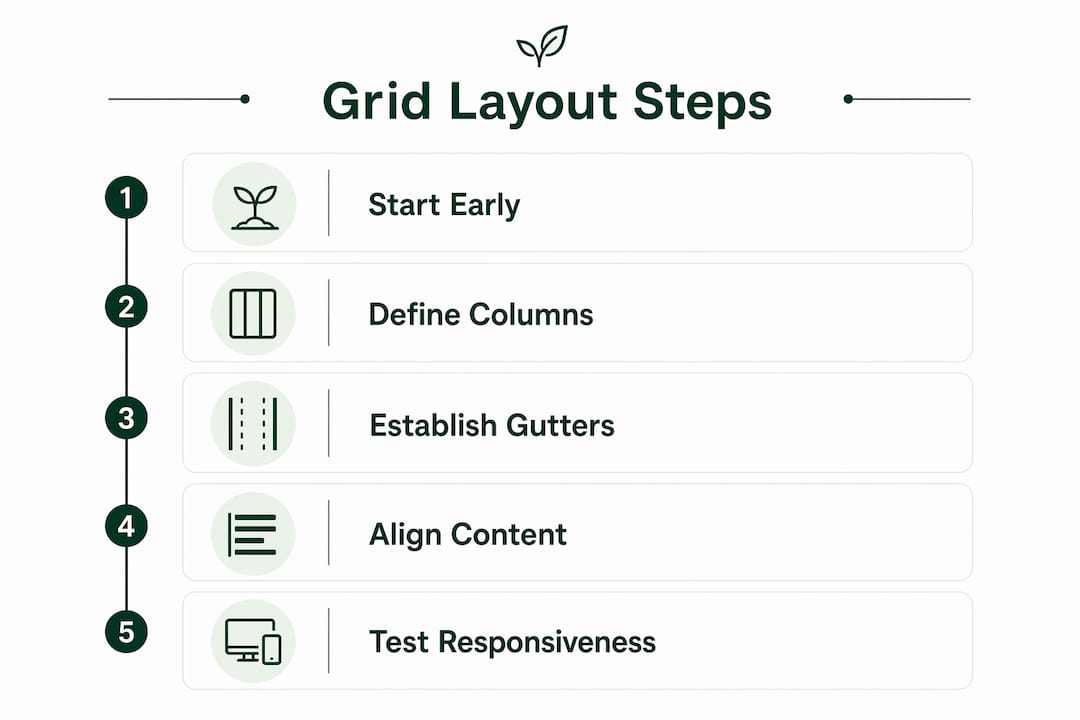
The single most important best practice: implement your grid at the start of the design process, not as a retrofit. Applying grid systems early maintains interface structural integrity and ensures consistent spatial logic throughout the entire lifecycle of a product. Bolting a grid onto a design that already exists creates misalignment, inconsistency, and rework.
Pro Tip: Embed grid tokens (column counts, gutter widths, breakpoints) in your shared design system from day one. When AI-assisted tools generate layouts from prompts, they pull from those tokens to produce output that follows your spatial rules automatically. A well-documented grid makes AI output predictable.
Practical steps for embedding grids effectively:
- Start with content, not the grid. Audit your content types before choosing a structure. The grid serves the content, not the other way around.
- Use an 8-point spacing system. Aligning all spacing to multiples of 8px keeps vertical and horizontal rhythm consistent and simplifies developer implementation.
- Design mobile-first. Start with a 4-column grid for mobile, expand to 8 for tablet, and 12 for desktop.
- Place content within columns, not gutters. Gutters stay empty to visually separate elements.
- Use CSS Subgrid for nested alignment. CSS Subgrid lets nested elements inherit the parent grid's column and row tracks, solving ragged-edge alignment in complex card layouts.
Do grids actually limit creativity? No, and here is why
The most persistent myth about grid systems is that they box you in. The opposite is true. Modern CSS Grid encourages experimentation by providing a flexible safety net that prevents small content changes from breaking overall layout alignment. Designers can move UI elements freely within the grid without creating extra work for developers.
The Interaction Design Foundation puts it plainly: grids "add structure to your design, organize information and create a consistent user experience." That structure is what makes creative risk-taking safe. When alignment is guaranteed by the grid, you can focus creative energy on typography, color, and hierarchy instead of manually policing spacing.
Creative freedom within grid constraints:
- Intentional grid breaks (a hero image bleeding past margins, a pull quote spanning an extra column) create visual emphasis without breaking the system
- Hierarchical grids let areas size according to content importance, producing visual drama while maintaining alignment
- CSS Grid's
grid-template-areasmakes complex, asymmetric layouts readable and maintainable - Designers can reorder stacked layouts across breakpoints with a few lines of CSS, no HTML restructuring needed
Real websites that show grid layouts working at scale
The best way to understand the impact of grid design is to look at how major sites actually use them.

The Guardian uses a modular grid system that traces directly back to Josef Müller-Brockmann's grid principles. Content cards snap to a consistent column structure, letting editors publish wildly different story types while the page stays visually coherent.
Behance runs a column grid where consistently sized gutters visually separate each portfolio piece. The grid does the organizational work so the creative content gets full attention.
Ritual.com uses a four-column grid at desktop size with fixed gutter widths that create breathing room between products. The margins are identical on both sides, giving the layout a balanced, trustworthy feel that supports the brand's premium positioning.
Google's Material Design reference apps (including the Shrine study) use column grids with deliberate grid breaks. Some elements span multiple columns while others do not, directing the user's eye to priority content without abandoning the underlying structure.
What these sites share: they all treat the grid as a design system foundation, not a one-time layout decision. The grid is embedded in their component libraries, which means every new page or feature inherits the same spatial logic automatically.
Talivo builds grid-based websites without the setup overhead
Most small businesses do not have a designer who knows CSS Grid or a developer who can configure breakpoints. That gap is exactly where Talivo fits.

Talivo generates professional, mobile-first websites in minutes using AI that already has grid-based responsive design baked in. Paste an outdated URL and Talivo rebuilds it with a modern layout that adapts cleanly across screen sizes. Have a Google Maps listing but no site? Talivo converts it directly into a full website, pulling in your photos, reviews, and contact details without requiring you to write a word of copy. For new businesses starting from scratch, the AI guides you through describing your business and generates a complete, grid-structured site from that description.
The result is a professionally structured website that follows the same responsive grid principles this article covers, without requiring you to configure a single breakpoint yourself. See how the process works at Talivo's how-it-works page.
Key Takeaways
Grid layouts are the foundational spatial system that makes modern responsive web design consistent, collaborative, and scalable across every device.
| Point | Details |
|---|---|
| Start grids early | Implement grid tokens at the design process start to maintain structural integrity throughout a product's lifecycle. |
| 12-column grid leads | The 12-column grid divides evenly into 2, 3, 4, and 6 columns, giving maximum layout flexibility for most web projects. |
| CSS Grid browser support is broad, making it safe to ship without legacy fallbacks | |
| Grids enable creativity | Intentional grid breaks and hierarchical sizing create visual drama while the underlying structure keeps alignment intact. |
| Talivo applies these principles | Talivo generates grid-based, mobile-first websites automatically, removing the setup burden for small businesses. |