
Website image optimization is the process of delivering high-quality images in the smallest possible file size, using the right format, dimensions, and loading strategy to maximize website speed and user experience. Images account for roughly 50% of total webpage bytes, making them the single biggest factor in poor Largest Contentful Paint scores. The benefits are direct: faster load times, better SEO rankings, lower bandwidth costs, and fewer frustrated visitors. Core techniques include the AVIF and WebP formats, the srcset attribute for responsive delivery, fetchpriority settings, and descriptive alt text. Developers and marketers who treat image optimization as a one-time task consistently leave performance on the table.
What is website image optimization, and why does it matter?
Website image optimization explained in plain terms: it is the discipline of balancing visual quality against file size and delivery speed, across every device and connection type. The industry term for this practice is web image performance optimization, and it covers decisions made at both encoding time and request time. Encoding-time and request-time decisions each carry distinct risks. Choosing the wrong format at encoding time inflates file size permanently. Misconfiguring CDN delivery at request time wastes that work entirely.
The business case is straightforward. A slow-loading hero image delays the Largest Contentful Paint metric, which Google uses directly in its ranking algorithm. Poor LCP scores push pages down in search results before a single visitor even sees the content. Faster images also reduce server egress costs, which matters at scale for any site serving thousands of sessions per day.

What are the best image formats for website optimization?
Format selection is the highest-impact optimization decision you will make for any image on your site. The wrong format can double or triple file size with no visible quality gain.
AVIF is the current leader for photographic content. AVIF reduces JPEG file sizes by roughly 50% without perceptible quality loss, making it the preferred choice for hero images, product photos, and any content-heavy visual. Browser support is now strong across Chrome, Firefox, and Safari, though roughly 7% of browsers still lack it. Always provide a WebP fallback for those cases.
WebP sits one tier below AVIF in compression efficiency but enjoys near-universal browser support. Use it as the fallback layer inside a <picture> element when AVIF is not supported.
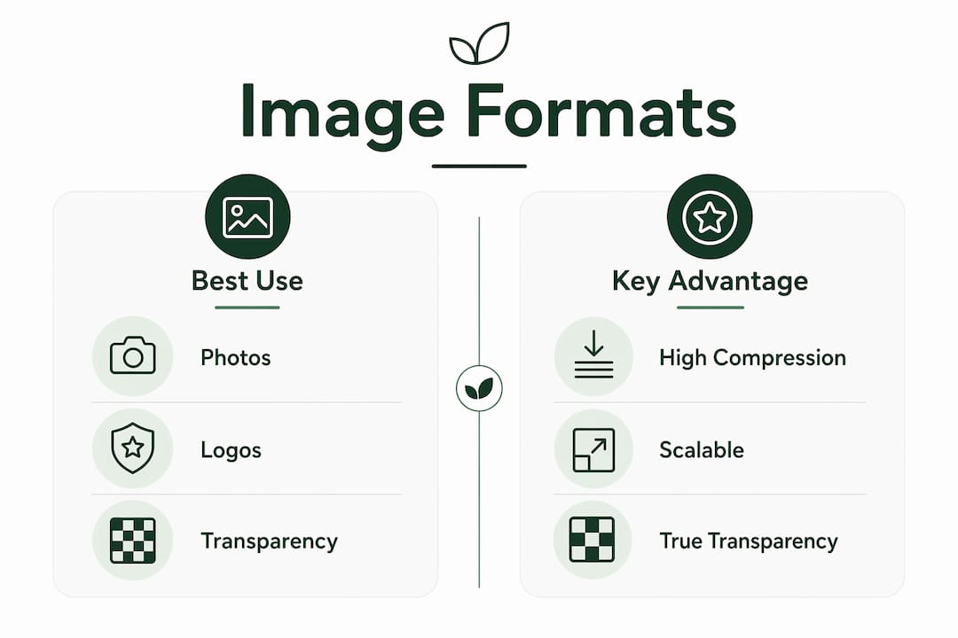
SVG is the correct choice for logos, icons, and illustrations. SVG files scale to any resolution without quality loss and typically weigh just a few kilobytes. Raster formats like PNG or JPEG for a logo are a common and costly mistake.
PNG remains necessary for images requiring true transparency where WebP is not an option, and for screenshots where lossless fidelity matters. Outside those cases, PNG is almost always the wrong choice for web delivery.
| Format | Best use case | Key advantage |
|---|---|---|
| AVIF | Photos, hero images | ~50% smaller than JPEG |
| WebP | General images, fallback | Near-universal support |
| SVG | Logos, icons, illustrations | Infinite scalability |
| PNG | Transparency, lossless screenshots | Pixel-perfect fidelity |
| JPEG | Legacy fallback only | Widest compatibility |
Pro Tip: Always wrap AVIF sources in a <picture> element with a WebP <source> and a JPEG <img> fallback. This three-layer approach covers every browser without serving oversized files to modern users.
How to implement responsive images effectively on websites
Responsive image delivery is one of the most misunderstood areas of web performance. The goal is simple: serve the smallest image that still looks sharp on the visitor's screen. The execution requires two HTML attributes working together.
The srcset attribute lists multiple image files at different widths. The sizes attribute tells the browser how wide the image will actually render at each viewport breakpoint. Without sizes, the browser assumes the image fills the full viewport width and downloads a file far larger than needed.
- Omitting
sizescauses mobile devices to download images 2–4 times larger than their screens require. That single mistake can add 1–3 seconds to LCP on mobile connections. - The
<picture>element enables art direction: serving a tightly cropped portrait on mobile and a wide landscape crop on desktop. This is different from simply resizing the same image. - Width and height attributes on every
<img>tag allow browsers to reserve the correct space before the image loads. Without them, the page reflows when the image arrives, increasing Cumulative Layout Shift scores and hurting both SEO and user experience. - CSS
aspect-ratioworks alongside explicit dimensions for fluid layouts, preventing layout shifts without locking images to fixed pixel sizes.
Pro Tip: Set width and height on every <img> tag even when CSS controls the display size. Browsers use these values to calculate the aspect ratio and reserve space, which eliminates layout shifts entirely.
How to optimize image loading priority and compression
Loading priority and compression quality are two levers that most developers set once and never revisit. Both deserve more attention.
Setting the right loading priority
The loading="lazy" attribute defers offscreen images until the visitor scrolls near them. This reduces the initial page payload significantly and is the correct setting for any image below the fold. The critical mistake is applying lazy loading to the hero or banner image at the top of the page.
The LCP image must never be lazy-loaded. Mark it with loading="eager" and fetchpriority="high" so the browser fetches it immediately. Developers who apply lazy loading globally as a performance fix often make their LCP score worse, not better.
Setting
fetchpriority="high"on your LCP image signals to the browser's preload scanner that this resource is critical. Without it, the browser may deprioritize the image behind scripts and stylesheets, adding hundreds of milliseconds to your largest paint time.
Compression quality and technique
Compressing images at a quality level around 80 produces results that are visually indistinguishable from the original while reducing file sizes by roughly 30%. Going below 70 introduces visible artifacts. Going above 85 adds file weight with no visible benefit.
- Lossy compression (JPEG, WebP, AVIF) discards some image data permanently. Use it for photographs where minor quality loss is invisible to the human eye.
- Lossless compression (PNG, SVG) removes redundant data without touching image quality. Use it for graphics, text-heavy images, and anything where pixel accuracy matters.
- Build-time compression runs during your deployment pipeline, converting and compressing images before they reach the CDN. Frameworks like Next.js, Nuxt, and Astro include built-in responsive image handling that automates this step.
- CDN-level transforms apply compression and format conversion dynamically at the edge, which is especially useful for user-generated content where build-time processing is not possible.
Pro Tip: Never apply fetchpriority="high" to more than one or two images per page. Overusing it defeats the purpose. The browser treats all high-priority resources equally, which removes the advantage entirely.
Best practices for image SEO and accessibility on websites
Image SEO is not a separate discipline from web performance. The two overlap directly, and neglecting either one costs you rankings and visitors.
- Alt text is the highest-impact ranking factor for images. Write descriptive, natural language descriptions that explain what the image shows. Screen readers depend on alt text, and Google uses it to understand image content. Avoid keyword stuffing; write for the person, not the algorithm. For more on accessibility in website updates, the connection between alt text and compliance is direct.
- File names act as ranking signals. A file named
blue-running-shoes-womens.jpgtells Google more thanIMG_4821.jpg. Rename files before uploading, using descriptive words separated by hyphens in the URL path. - ImageObject structured data embeds machine-readable context around your images. Structured data with ImageObject schema produces 4x more citations in AI-generated answers and enables Google Shopping rich results on product pages.
- EXIF metadata should be stripped before publishing. GPS coordinates embedded in smartphone photos are a privacy risk and add unnecessary bytes to every file.
- XML sitemaps should include image entries. Google's image sitemap extension tells the crawler exactly which images exist on each page, accelerating indexing for new content.
Pro Tip: Use a tool that strips EXIF data automatically during your upload or build process. Manually checking every image is not realistic at scale, and GPS data in published photos is a liability.
How do you monitor and maintain image optimization over time?
Image optimization is not a one-time project. Traffic patterns and device mixes evolve, and what worked six months ago may underperform today as your audience shifts toward new devices or connection types.
- Core Web Vitals monitoring tracks LCP and CLS in real user conditions, not just lab tests. The Chrome UX Report provides field data from actual visitors, which often reveals problems that synthetic tests miss.
- Routine audits should check image file sizes, format usage, lazy loading configuration, and whether
widthandheightattributes are present on every<img>tag. Many outdated website design mistakes trace directly back to images that were never audited after launch. - Automated workflows using framework image components or CDN transforms reduce manual overhead. Frameworks like Next.js, Nuxt, and Astro handle format conversion and responsive sizing automatically, freeing developers to focus on content rather than file management.
- User-generated content requires CDN-level transforms because build-time processing cannot anticipate images uploaded after deployment. Configure your CDN to apply format conversion and compression rules dynamically.
Continuous testing and monitoring is the only way to confirm that optimization gains hold as the site grows. Set up automated alerts for LCP regressions so you catch problems before they affect rankings.
Key takeaways
Effective image optimization requires the right format, responsive delivery, correct loading priority, and ongoing monitoring working together. No single technique alone produces lasting results.
| Point | Details |
|---|---|
| Choose AVIF first | AVIF cuts file sizes by ~50% vs. JPEG; always include WebP and JPEG fallbacks. |
| Use srcset and sizes together | Without the sizes attribute, mobile devices download images 2–4 times too large. |
| Never lazy-load the LCP image | Mark your hero image with fetchpriority="high" and loading="eager" to protect LCP scores. |
| Compress at quality 80 | This level is visually indistinguishable from the original and reduces file size by ~30%. |
| Monitor Core Web Vitals continuously | Traffic and device changes require ongoing audits to sustain performance gains. |
What I've learned from years of watching image optimization go wrong
The most common failure I see is not a technical one. Developers implement AVIF, add srcset, and set lazy loading correctly, then ship the site and never look at images again. Six months later, a content team has uploaded 4MB PNGs through the CMS, the LCP has doubled, and nobody noticed because nobody was watching.
The second most common failure is misplaced fetchpriority="high". I have audited sites where every above-the-fold image carried that attribute. The browser treats them all equally, which means none of them get prioritized. The fix takes five minutes once you understand the problem, but the damage to LCP scores can be significant.
What actually works is treating image optimization as a workflow problem, not a one-time configuration. Build compression and format conversion into your deployment pipeline. Configure your CMS to enforce size limits on uploads. Set up a Core Web Vitals alert so LCP regressions surface immediately. The technical decisions matter, but the process around them matters more.
I am also watching AI-assisted alt text generation with genuine interest. The quality has improved to the point where it handles straightforward product images well. The gap remains in nuanced or context-dependent images where a human still writes better descriptions. My current recommendation: use AI generation as a first draft, then review anything that appears in a prominent position on the page.
For developers planning a site redesign, the website redesign approaches for small businesses conversation almost always underweights image strategy. Format decisions made at the start of a project are far cheaper to get right than to fix after launch.
— jacopo
Talivo handles image performance so you can focus on your business
Building a performant website from scratch means making dozens of image decisions before a single visitor arrives. Talivo handles the technical side automatically. When you build or redesign a site with Talivo's AI platform, modern image formats, responsive sizing, and lazy loading are applied by default. You do not configure srcset by hand or manually convert files to WebP.

Talivo also automates SEO metadata for images, so alt text and file naming follow best practices without requiring a separate audit. For marketers who need a fast, well-optimized site without a development team, and for developers who want a reliable starting point, see how Talivo works and what it handles out of the box.
FAQ
What is website image optimization?
Website image optimization is the process of reducing image file sizes while preserving visual quality, using the right formats, dimensions, and loading attributes to improve page speed and SEO.
Which image format is best for websites in 2026?
AVIF is the best format for photographs, reducing file sizes by roughly 50% compared to JPEG. Use WebP as a fallback and SVG for logos and icons.
Does image optimization improve SEO?
Yes. Faster-loading images improve Largest Contentful Paint scores, which Google uses as a ranking signal. Descriptive alt text and ImageObject structured data also increase search and AI visibility directly.
What compression quality should I use for web images?
Compress at a quality level of around 80. This setting produces results that are visually indistinguishable from the original while cutting file sizes by approximately 30%.
Should I lazy-load all images on a webpage?
No. Apply loading="lazy" only to images below the fold. The hero or banner image at the top of the page must use loading="eager" and fetchpriority="high" to protect your LCP score.