
Design consistency is the foundation every site needs
Design consistency means applying the same visual and functional rules across every page of a website: the same colors, type styles, button behaviors, spacing, and navigation patterns. It sounds basic. The impact is anything but.

The principle behind it is Jakob's Law: users spend most of their time on other sites, so they arrive at yours with expectations already formed. When your site matches those expectations, they move through it without friction. When it doesn't, they hesitate, and hesitation is expensive.
Here's what consistent design actually does for a site:
- Reduces the learning curve. Users transfer knowledge from familiar patterns instead of relearning your interface from scratch.
- Lowers bounce rates. Unpredictable layouts and shifting navigation push visitors out before they convert.
- Builds brand recognition. A uniform visual language makes your brand memorable across every touchpoint.
- Signals professionalism. Mismatched fonts or inconsistent button styles quietly communicate that a site is poorly maintained.
- Prevents user frustration. When elements behave the same way every time, users stay confident and in control.
Think of it as the difference between a well-organized store and one where the aisles rearrange themselves every visit. One earns loyalty. The other earns abandoned carts.
Table of Contents
- How consistent design makes your site easier and more satisfying to use
- Consistent design is trust architecture, not just aesthetics
- How to balance consistency with creativity without boring your users
- How Talivo uses AI to keep your site consistently on-brand
- Key Takeaways
How consistent design makes your site easier and more satisfying to use
Predictability is the engine of good usability. When users know where the navigation lives, what a primary button looks like, and how errors will be communicated, they stop thinking about the interface and start focusing on their actual goal.
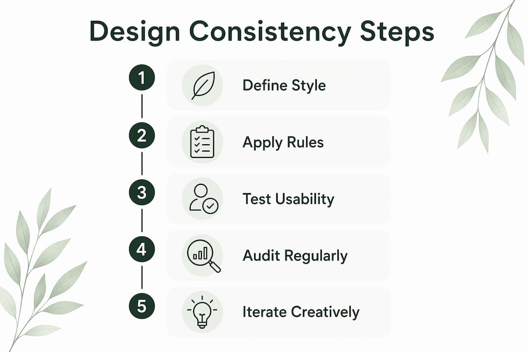
Inconsistent design forces users to relearn the interface repeatedly, which drives frustration and drop-off. Consistent navigation, typography, and color schemes reduce cognitive load so users can move faster and make fewer mistakes. Consistent copy and terminology across UI elements prevent confusion and keep workflows moving. Even something as subtle as standardized error message placement reduces anxiety: when an error appears in the same spot and speaks the same language every time, users correct and continue rather than panic and leave.
Usability benefits that compound over time:
- Faster task completion because users aren't hunting for familiar elements
- Fewer errors from predictable button behaviors and clear labeling
- Higher satisfaction scores when the experience feels polished and intentional
- Better search engine rankings driven by lower bounce rates and stronger engagement signals
- Easier onboarding for new visitors who rely on patterns from other sites they already know
Pro Tip: Run usability tests every quarter, not just at launch. User expectations shift as digital products evolve, and a consistency gap that didn't exist in 2024 can quietly erode your conversion rate by 2026.
Consistent design is trust architecture, not just aesthetics
There's a phrase worth keeping: consistency is trust architecture. It describes something designers have observed for years but rarely articulate this cleanly. Every repeated decision, every button that behaves the same way, every heading that follows the same hierarchy, is a small promise kept. Enough kept promises and users stop questioning the interface entirely.
The inverse is just as true. Hidden inconsistencies like differing button padding or a label that changes wording mid-flow impose cognitive taxes that accumulate. A single shifted CTA is forgiven. A site full of micro-surprises trains users to distrust every click. That distrust doesn't announce itself. It shows up as abandoned carts, shorter sessions, and visitors who never return.
Consistent design decisions create a considerate environment that respects users' time and effort. That respect is what converts a first-time visitor into a repeat customer. Flashy branding might attract the first click. Consistency is what earns the second visit.
How to balance consistency with creativity without boring your users
Rigid consistency has a real failure mode: monotony. A site where every page looks identical, every section follows the same template, and every interaction feels identical can feel sterile. Users engage less, not more.
The solution isn't to abandon consistency. It's to practice what designers call creative consistency: maintaining the core visual and functional rules while allowing deliberate, purposeful exceptions that serve the user experience. Jakob Nielsen's heuristics make this explicit: consistency should maximize efficiency by respecting user expectations without restricting creativity unnecessarily. A bold hero image, an unexpected color accent on a key CTA, or a distinctive illustration style can all coexist with a consistent grid, type scale, and navigation pattern.
The rule is simple: clarity first, creativity second. A beautiful layout that confuses users is a failed layout.
Best practices for holding both at once:
- Anchor creativity to the brand system. Unique elements should feel like extensions of the design language, not departures from it.
- Limit typeface variety. Two or three type styles across a site is the practical ceiling before things feel unstructured.
- Use color breaks intentionally. A deviation from the primary palette draws the eye. Use it to guide users toward key actions, not just for visual interest.
- Keep navigation placement fixed. Users forgive a lot of visual experimentation when they always know where to go next.
- Document exceptions. Without a shared design language, creative exceptions become bespoke one-offs that accumulate into UX debt.
A well-run grid layout gives creative elements a spine to push against. That tension, structure plus deliberate deviation, is what makes a site feel both trustworthy and alive.
How Talivo uses AI to keep your site consistently on-brand
Maintaining design consistency manually is genuinely hard, but tools like the AI Digital Product Builder can analyze and enforce predictable UX patterns across your site. Designers drift. Teams grow. Pages get added by different people at different times. The result is a site that started coherent and slowly became a patchwork.
AI tools can perform automated design audits, detect inconsistencies, and enable rapid corrections at a scale no manual review process can match. Talivo takes this further by building consistency into the generation process itself. When you paste an existing URL, Talivo's AI reads the site's current design language and rebuilds it with a modern, mobile-first structure that preserves your content while enforcing a unified visual system. When you start from a Google Maps listing or a plain-text description, the platform generates a complete site from a single source of truth, so there's no drift between pages from the start.
The practical result: no mismatched button styles between your homepage and your contact page, no font inconsistencies between sections written six months apart, no navigation that behaves differently on mobile than on desktop. For small business owners who don't have a dedicated design team, that kind of automated coherence is the difference between a site that builds trust and one that quietly undermines it.
You can explore how the process works at Talivo's AI website builder or walk through the step-by-step flow at how it works.
If you want to go deeper on auditing what you already have, the website design consistency audit guide covers the full process for 2026.
Key Takeaways
Design consistency is the single most reliable way to build user trust, reduce friction, and strengthen brand identity across every page of a site.
| Point | Details |
|---|---|
| Jakob's Law drives usability | Users transfer knowledge from familiar patterns, so matching their expectations reduces friction immediately. |
| Inconsistency raises bounce rates | Unpredictable layouts and shifting behaviors force users to relearn the interface, pushing them to leave. |
| Consistency functions as trust | Repeated, predictable decisions signal professionalism and respect for users' time, converting visitors into repeat customers. |
| Creative consistency prevents monotony | Deliberate exceptions within a stable design system keep users engaged without sacrificing clarity or coherence. |
| AI enforces consistency at scale | Platforms like Talivo automate design audits and component unification, eliminating drift across pages and teams. |