
Website navigation is the system that guides users through a website, enabling efficient access to information and directly shaping every aspect of usability. Poor navigation is the single most common reason users abandon a site before converting. The importance of website navigation shows up in bounce rates, session length, and ultimately revenue. Organizations like the Nielsen Norman Group and the W3C have spent decades defining what good navigation looks like, and their findings converge on one point: structure and clarity beat visual polish every time. Understanding why website navigation matters to users is the first step toward building a site that actually works.
Why does website navigation matter to users?
Navigation clarity determines whether a user stays or leaves. When users land on a page and cannot immediately understand how to find what they need, they experience cognitive friction. That friction translates directly into frustration, distrust, and site abandonment. Poor navigation increases bounce rates, reduces engagement, and hurts conversions. The implication is straightforward: a visually attractive site with confusing navigation will consistently underperform a plain site with clear menus.
Navigation also shapes how users perceive a brand. A site that is easy to move through signals competence and care. A site that buries key pages under unclear labels signals the opposite. Users form these judgments within seconds, and they rarely give a second chance.

The user experience and navigation relationship runs deeper than most site owners realize. Navigation is the primary tool users rely on to build a mental map of a site. When that map matches their expectations, they feel oriented and confident. When it does not, they feel lost. The W3C's Web Content Accessibility Guidelines (WCAG) address this directly, requiring consistent navigation structure and wayfinding feedback to prevent disorientation, especially for users with cognitive disabilities.
Pro Tip: Test your navigation with five people who have never seen your site. Ask them to find your three most important pages without any guidance. Their hesitations reveal exactly where your structure breaks down.
What makes website navigation effective?
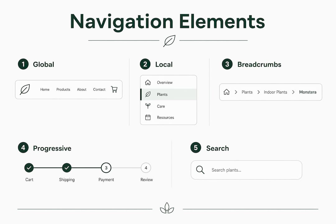
Effective navigation rests on four structural types, each serving a distinct purpose. Global navigation appears on every page and provides access to the site's main sections. Local navigation handles movement within a section. Breadcrumbs show users where they are within the hierarchy. Supplemental navigation, such as site search and footer links, catches users who cannot find what they need through the primary menus.
Label clarity
Label clarity is one of the top navigation success factors, according to the Nielsen Norman Group. Labels must use the vocabulary users already know, not internal organizational language. A financial services firm that labels its menu "Solutions" instead of "Products" or "Services" creates immediate confusion. Users should never have to guess what a link contains.
Wayfinding feedback
Wayfinding feedback tells users where they are at any given moment. Active states on menu items, highlighted breadcrumb trails, and page titles that match navigation labels all serve this function. Breadcrumb navigation provides vital location awareness in multi-level site hierarchies, reducing the number of users who feel lost in deep content structures.
Menu depth and breadth
The balance between breadth and depth in a menu hierarchy directly affects cognitive load. A flat structure with many top-level items forces users to scan long lists. A deep structure with many nested levels forces users to click repeatedly without knowing if they are getting closer to their goal. Research by Nielsen Norman Group shows that users generally tolerate up to 6–7 top-level navigation items before task success begins to decline. That number is not arbitrary. It aligns with Miller's Law, which describes the limits of human working memory.
Progressive disclosure
Progressive disclosure is a technique that reveals navigation options only when they become relevant, rather than displaying everything at once. Revealing sub-menus contextually keeps interfaces clean and manageable, which is especially critical on mobile screens where space is limited. A mega-menu that works on desktop becomes a wall of text on a phone.
Pro Tip: On mobile, test your navigation with one thumb. If users cannot reach key menu items without shifting their grip, your mobile navigation needs redesign.
What navigation failures hurt users most?
Navigation failures follow predictable patterns, and recognizing them is half the battle.
- Overloaded menus. Decision time increases logarithmically with choices, per Hick's Law. A menu with 12 top-level items does not give users more options. It slows them down and increases the chance they choose nothing. Menus exceeding 7 primary items consistently reduce task completion rates.
- Vague or brand-centric labels. Labels like "Our World," "The Hub," or "Explore" tell users nothing about what they will find. Label clarity should prioritize the user's vocabulary over internal organizational language. When labels match user expectations, navigation becomes invisible in the best possible way.
- Mismatch with user mental models. Users arrive at a site with assumptions about where things should live. A site that organizes content by internal department rather than by user task creates a constant mismatch. Tree testing, a method where users are asked to find items in a text-only version of the site structure, reveals these mismatches before launch.
- Inconsistent or hidden menus. Navigation that changes between sections, or that disappears on certain pages, disorients users immediately. The W3C's WCAG guidelines flag inconsistent navigation as a direct accessibility barrier. Check out common design pitfalls that include exactly these kinds of structural problems.
- No visible current location. Users who cannot tell where they are on a site cannot plan how to get where they want to go. Missing active states and absent breadcrumbs are among the most common and most damaging navigation oversights.
How do you apply website navigation best practices?
Good navigation design follows a clear set of principles. Applying them consistently produces measurable improvements in user behavior.
- Limit top-level items to 4–7 categories. This range respects cognitive limits and keeps decision time low. If your content requires more categories, consider grouping related items under a parent label rather than expanding the top level.
- Write labels in plain language. Use the words your users use, not the words your organization uses internally. Conduct a quick card-sorting exercise where users group and label content themselves. The results will likely surprise you.
- Make the current location visible. Highlight the active menu item. Show breadcrumbs on pages deeper than two levels. Match the page title to the navigation label that led there. These three steps alone eliminate most wayfinding confusion.
- Apply progressive disclosure on mobile. Collapse secondary navigation behind a clear trigger. Reveal sub-menus only when a user selects a parent category. This approach keeps the interface manageable without hiding important content. Learn more about accessible navigation structures that follow W3C standards.
- Design mobile navigation separately. Mobile users navigate differently than desktop users. They scroll more, tap rather than hover, and often use one hand. A hamburger menu works for secondary navigation, but critical actions should remain visible without opening any menu at all.
- Test with real users before and after changes. Tree testing and first-click testing are low-cost methods that reveal whether your structure matches how users think. Run them before redesigning and again after to measure improvement.
Pro Tip: Run a first-click test on your homepage. If fewer than 80% of users click the correct starting point for your most important task, your navigation needs structural work, not just visual polish.
Navigation is also an SEO asset. Search engines use site structure to understand content relationships and assign topical authority. Clear, logical navigation helps crawlers index pages efficiently. That means good navigation design for users also improves organic search performance, a benefit that compounds over time.
Key Takeaways
Clear, well-structured navigation is the single most important factor in whether users find what they need, stay on a site, and convert.
| Point | Details |
|---|---|
| Navigation drives user behavior | Poor navigation increases bounce rates and abandonment before users reach conversion points. |
| Cognitive limits define menu length | Keep top-level items within 4–7 to respect Hick's Law and Miller's Law limits. |
| Labels must use user vocabulary | Prioritize plain language over internal jargon to reduce confusion and navigation mismatch. |
| Wayfinding prevents disorientation | Breadcrumbs, active states, and consistent structure keep users oriented across all pages. |
| Mobile navigation needs separate design | Progressive disclosure and thumb-friendly layouts are non-negotiable for mobile usability. |
Navigation is an architecture problem, not a design problem
Most teams treat navigation as a visual design task. They debate icon choices, hover colors, and font sizes. Those decisions matter at the margin, but they do not fix a broken structure. Navigation is an information architecture problem first. A beautifully styled menu built on a flawed content hierarchy will still fail users.
I have seen this play out repeatedly on sites that invested heavily in visual redesigns without touching their underlying structure. The new site looked modern. Users still could not find the pricing page. The bounce rate barely moved.
The other mistake I see constantly is treating navigation as a one-time decision. Navigation systems require ongoing governance linked to content volume, user research, and organizational changes. Every time a business adds a new product line or restructures a department, the navigation needs a review. Sites that skip this governance end up with menus that reflect the company's history rather than the user's needs.
Navigation also carries accessibility weight that most teams underestimate. A site with poor navigation is not just frustrating for average users. It is genuinely unusable for people relying on screen readers or keyboard navigation. Accessibility and usability are not separate goals. They are the same goal measured from different angles. The modern web design principles that serve small businesses well are the same ones that serve all users well.
My honest recommendation: audit your navigation before you touch anything else on your site. Map every top-level item, every sub-menu, and every label. Ask whether each one reflects what a user would call it, not what your team calls it. That single exercise will surface more improvement opportunities than any visual redesign.
— jacopo
How Talivo builds navigation that works from day one
Building a website with clear, user-friendly navigation from scratch takes time and expertise that most small business owners do not have on hand. Talivo removes that barrier entirely.
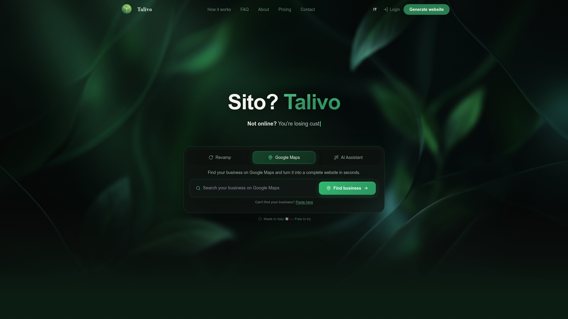
Talivo's AI-powered platform creates complete websites with logical, well-structured navigation built in automatically. Whether you paste an outdated URL for a full redesign, convert a Google Maps listing into a live site, or describe your business from scratch, Talivo applies current navigation best practices without requiring any technical knowledge from you. The result is a site where users can find what they need immediately, which means lower bounce rates and more conversions from day one. See how the process works at Talivo's website builder and get a site that works as well as it looks.
FAQ
What is website navigation in web design?
Website navigation is the system of menus, links, and structural cues that guide users through a site's content. It includes global menus, local menus, breadcrumbs, and supplemental tools like site search.
How does navigation affect user experience?
Poor navigation increases bounce rates, reduces session duration, and lowers conversions. Clear navigation builds user trust and helps visitors complete tasks efficiently.
How many items should a navigation menu have?
Research by Nielsen Norman Group shows that 6–7 top-level items is the practical limit before task success declines. Keeping menus within 4–7 items respects cognitive load limits defined by Miller's Law.
What is progressive disclosure in navigation?
Progressive disclosure is a technique that reveals navigation options only when they become relevant, rather than showing all options at once. It reduces cognitive load and is especially effective on mobile interfaces.
Why does navigation matter for SEO?
Search engines use site structure to understand content relationships and crawl pages efficiently. Clear, logical navigation helps search engines index a site correctly, which supports organic search rankings over time.