
To convert a static site to mobile-responsive, you need five changes: add the viewport meta tag, switch to fluid layout units, fix your images, redesign navigation for touch, and optimize load speed. No full rebuild required.
Start here, right now:
- Add
<meta name="viewport" content="width=device-width, initial-scale=1">to the<head>of every page - Set
img { max-width: 100%; height: auto }globally - Replace fixed-pixel containers with
width: 100%; max-width: [value] - Run a Lighthouse audit on your three highest-traffic pages to baseline your current mobile score
- If you want a managed, done-for-you option, Talivo can rebuild your site from your existing URL with a mobile-first design in minutes
Table of Contents
- What should you audit before converting your static site?
- How to convert a static site to mobile-responsive, step by step
- Copy-and-paste code recipes for responsive static sites
- How do you test mobile responsiveness and which metrics matter?
- How long does a static site conversion take, and what does it cost?
- Should you convert the site yourself or hire a professional?
- Common mistakes when converting static sites to mobile-responsive
- A note from Jacopo on real-world trade-offs
- How do you handle older browsers and devices during conversion?
- Key Takeaways
- Why mobile-first conversions directly affect your revenue
- Talivo rebuilds your static site as a mobile-first website
- Useful sources and tools
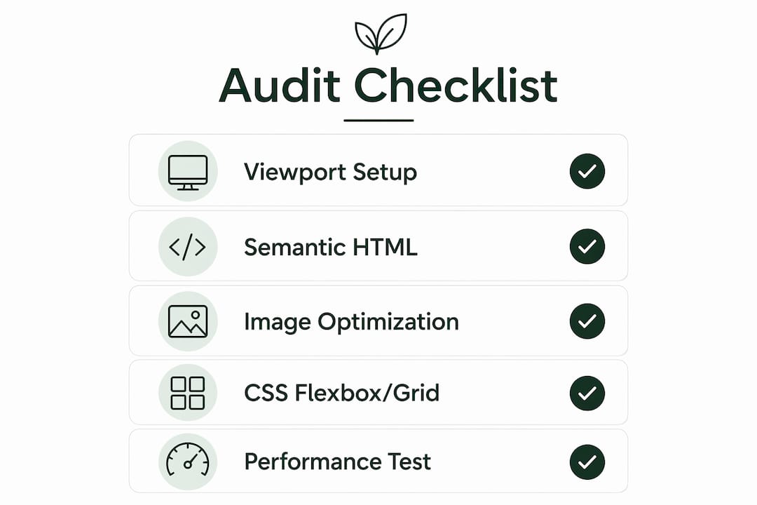
What should you audit before converting your static site?
A fast audit saves you from fixing the wrong things first. Pull your Google Analytics data and sort pages by mobile sessions and revenue. Those are your conversion priorities, not the homepage by default.
Then scan your HTML for these red flags:
- Fixed-width containers using
width: 600pxor similar pixel values - Table-based layouts used for visual structure rather than actual tabular data
- Inline
widthandheightattributes on images and embeds - Hover-only menus that have no touch fallback
- Large uncompressed images and YouTube/Vimeo embeds with hardcoded dimensions
- Desktop-only JavaScript that breaks on narrow viewports
Check your semantic HTML while you're in there. Google's mobile-first indexing crawls the mobile version of your pages first, so missing landmarks (<nav>, <main>, <footer>) hurt both accessibility and search visibility. Also flag any outdated website features like Flash embeds or wide data tables that will need removal.
Pro Tip: Sort your audit spreadsheet by mobile bounce rate, not just traffic. A page with moderate traffic but a 90% mobile bounce rate is costing you more than a low-traffic page ever could.
How to convert a static site to mobile-responsive, step by step
This sequence is designed to be handed to a developer or followed yourself. Work in phases so the site stays usable throughout.
-
Step 0 — Global baseline. Add the viewport meta tag to every page template. Add a CSS reset and
*, *::before, *::after { box-sizing: border-box }. These two changes cost almost nothing and prevent a class of layout bugs that will otherwise haunt every later step. -
Step 1 — Mobile-first CSS. Write base styles for the smallest screen first, then layer complexity upward with
@media (min-width: ...)queries. Useremfor font sizes,%orvwfor widths, andclamp()for fluid typography:font-size: clamp(1rem, 2.5vw, 1.5rem). -
Step 2 — Fluid layout. Replace every fixed-pixel container with
width: 100%; max-width: 1200px; margin-inline: auto. Adopt Flexbox for single-axis sections and CSS Grid for two-dimensional layouts. No framework needed for most static sites. -
Step 3 — Images and media. Set
img { max-width: 100%; height: auto }globally. Addsrcsetandsizesattributes to key images so browsers download the right resolution. Wrap YouTube and Vimeo embeds in a container withaspect-ratio: 16/9andwidth: 100%to make them fluid. -
Step 4 — Navigation and touch. Tap targets need at least 44×44px of clickable area. Collapse complex menus into a hamburger pattern on narrow viewports. Remove hover-only dropdowns entirely or add a tap equivalent. More detail on redesigning non-mobile menus is worth reading before this step.
-
Step 5 — Performance. Defer noncritical JavaScript with the
deferattribute. Inline critical above-the-fold CSS. Convert images to WebP or AVIF. Enable gzip or Brotli compression on your server. Addloading="lazy"to offscreen images. Nearly half of mobile visitors leave if a page takes longer than 3 seconds to load. -
Step 6 — Phased rollout. Convert your top three pages first, test them, then move to the next batch. Keep a staging environment. Never push untested changes directly to production.
Pro Tip: Don't try to fix every page at once. Converting one template fully, testing it across devices, and then replicating that pattern is faster than a sitewide half-fix.
Copy-and-paste code recipes for responsive static sites
These patterns cover the majority of layout work on a typical static-to-responsive conversion. You can use all of them without adding a framework.
-
Fluid container:
.container { width: 100%; max-width: 1200px; margin-inline: auto; padding-inline: clamp(1rem, 5vw, 2rem); } -
Mobile-first media query pattern:
/* Base: mobile */ .card { flex-direction: column; } /* Tablet and up */ @media (min-width: 768px) { .card { flex-direction: row; } } -
Auto-fit Grid (no media queries needed):
.grid { display: grid; grid-template-columns: repeat(auto-fit, minmax(280px, 1fr)); gap: 1.5rem; } -
Responsive images:
<img src="photo-800.jpg" srcset="photo-400.jpg 400w, photo-800.jpg 800w, photo-1200.jpg 1200w" sizes="(max-width: 600px) 100vw, 50vw" loading="lazy" alt="Description"> -
Fluid video embed:
.embed-wrapper { aspect-ratio: 16/9; width: 100%; } .embed-wrapper iframe { width: 100%; height: 100%; } -
CSS reset baseline:
*, *::before, *::after { box-sizing: border-box; margin: 0; padding: 0; }
Modern CSS Grid and Flexbox handle virtually every layout scenario a static site needs. Adding Bootstrap or a similar framework on top of an existing site typically increases payload without adding capability.
How do you test mobile responsiveness and which metrics matter?
Testing sequence: local staging first, then Chrome DevTools emulation, then Lighthouse, then at least one real Android and one real iOS device before you deploy.
Tools to use:
- Chrome DevTools device toolbar for quick emulation across common screen sizes
- Lighthouse (built into DevTools) for a scored audit of performance, accessibility, and best practices
- PageSpeed Insights for field data from real users on your live site
- Real devices for touch behavior, font rendering, and scroll feel that emulators miss
Key metrics and targets:
| Metric | What it measures | Target |
|---|---|---|
| First Contentful Paint (FCP) | Time until first content appears | Under 3 seconds |
| Largest Contentful Paint (LCP) | Time until main content loads | Under 2.5s |
| Cumulative Layout Shift (CLS) | Visual stability during load | — |
| Time to Interactive (TTI) | When the page responds to input | — |
| Mobile bounce rate | Visitors who leave without interacting | Track change vs. baseline |
After deploying each batch of pages, check PageSpeed Insights again and compare against your pre-conversion baseline. A rising LCP after you added a new image format is a signal to revisit compression settings.
How long does a static site conversion take, and what does it cost?
Timeline depends almost entirely on the number of unique templates, not the number of pages.
- Single landing page: 1–3 days
- Small static site (5–20 pages, 2–4 templates): 1–3 weeks
- Complex site or many legacy templates: 4–12 weeks
The biggest cost drivers are image and media cleanup, custom JavaScript behaviors that need refactoring, accessibility remediation, and QA time across devices. A site with 50 pages but only three templates converts much faster than a 15-page site where every page was hand-coded differently.
Phase the work: audit, then global fixes, then template conversion, then remaining pages, then performance polish. Keep pages live throughout by working on a staging branch and managing the redesign in defined sprints.
Should you convert the site yourself or hire a professional?
| Scenario | DIY | Hire a pro or service |
|---|---|---|
| Skills required | Basic HTML/CSS, can run staging | Complex JS, accessibility, or multiple templates |
| Number of templates | 1–3 | 4+ or heavily customized |
| Timeline pressure | Flexible | Needs to ship fast |
| Budget | Minimal | Can invest $500–$5,000+ depending on scope |
| Risk tolerance | Can test and iterate | Needs guaranteed quality |
DIY works well when you control the site files, have a staging environment, and the site has a small number of templates. If your site has complex JavaScript interactions, strict WCAG accessibility requirements, or you simply need it done in days rather than weeks, hiring a developer or using a managed service is the smarter call.

Pro Tip: Before hiring anyone, count your unique page templates, not your pages. That number determines scope more accurately than anything else.
Talivo is worth considering if you want a fast, managed path: paste your existing URL and Talivo rebuilds it as a mobile-first site, retaining your content and images.
Common mistakes when converting static sites to mobile-responsive
Avoid these before they cost you a week of rework:
-
Patching desktop CSS instead of rewriting it. Layering mobile overrides on top of fixed-pixel styles creates specificity conflicts that compound with every new page. Rewrite global styles mobile-first from the start.
-
Forgetting the viewport meta tag. Without it, mobile browsers render the page at desktop width and scale it down. Your CSS media queries won't fire correctly. Verify this tag is on every page before touching anything else.
-
Oversized images breaking layout. A single image without
max-width: 100%can blow out a fluid container. Fix assets first; it often produces the fastest visible improvement. -
Adding a heavy framework to fix a small problem. Bootstrap adds roughly 30KB of CSS you probably won't use. Native Grid, Flexbox, and
clamp()cover the same ground with zero added payload.
Responsive design is a mindset shift, not just a technical patch. The goal is to simplify layouts for mobile, not to shrink a desktop design onto a small screen. Sites that try to preserve every desktop element on mobile end up with cramped, unusable interfaces regardless of how technically correct the CSS is.
A note from Jacopo on real-world trade-offs
Most static sites I see have the same three problems: no viewport tag, fixed-pixel containers, and images without max-width. Fix those three things and you'll see an immediate improvement in mobile usability before you touch anything else.
The biggest time sink in a static-to-responsive project is almost never the CSS. It's the content: logos in the wrong format, images with hardcoded dimensions in the HTML, and YouTube embeds with
width="560"baked into the markup. Audit your assets before you write a single media query, and you'll cut your total project time significantly.Talivo was built for exactly the businesses that don't have weeks to spend on this. Paste your URL, and the platform rebuilds your site with a mobile-first structure, keeping your content intact.
How do you handle older browsers and devices during conversion?
Modern CSS Grid and Flexbox have broad support across current browsers, but a small percentage of visitors may use older versions of Safari, Chrome, or Firefox. A few practical strategies:
Use @supports to provide fallbacks for features like aspect-ratio or container queries:
@supports not (aspect-ratio: 16/9) {
  .embed-wrapper { padding-top: 56.25%; position: relative; }
  .embed-wrapper iframe { position: absolute; top: 0; left: 0; width: 100%; height: 100%; }
}
For Grid, define a Flexbox fallback first, then override with Grid for browsers that support it. Older browsers ignore the Grid rule and render the Flexbox layout instead. Use autoprefixer in your build process to add vendor prefixes automatically where they're still needed. Test on BrowserStack or a similar cross-browser tool if your analytics show meaningful traffic from older browser versions. Avoid relying on clamp() without a fixed fallback value for browsers that don't support it.
Key Takeaways
Converting a static site to mobile-responsive requires the viewport meta tag, mobile-first CSS, fluid layout units, responsive images, and performance optimization, in that order.
| Point | Details |
|---|---|
| Start with the viewport tag | Add <meta name="viewport" content="width=device-width, initial-scale=1"> to every page before any other change. |
| Fix assets before CSS | Set img { max-width: 100%; height: auto } globally; asset fixes often produce the fastest visible improvement. |
| Mobile-first CSS baseline | Write base styles for small screens and layer up with min-width media queries using rem, %, and clamp(). |
| Test with Lighthouse | Target LCP under 3 seconds; run PageSpeed Insights before and after each batch of changes. |
| Talivo for fast conversion | Paste your existing URL into Talivo and get a mobile-first rebuild without rewriting code yourself. |
Why mobile-first conversions directly affect your revenue
Small business owners often treat mobile responsiveness as a design preference. It isn't. Google indexes the mobile version of your site first, so a broken mobile layout suppresses your search rankings regardless of how well-optimized your desktop version is. A poor mobile experience raises bounce rates, and a higher bounce rate signals to Google that your page isn't satisfying the query.
The business case is direct: fix mobile, and you improve search visibility, reduce bounce, and make it easier for customers to contact or buy from you on the device they're actually using.
Talivo rebuilds your static site as a mobile-first website
If the steps above feel like more than you want to manage yourself, Talivo offers a faster path. Paste your existing site URL and Talivo's AI rebuilds it with a modern, mobile-first design, retaining your content, images, and contact information. No copywriting, no manual CSS rewriting, no staging environment to configure.

Nearly half of mobile visitors leave a site that takes more than 3 seconds to load. Talivo's output is optimized for speed from the start, not as an afterthought. Visit talivo.tech to see how it works, or check the how it works page for a walkthrough of the AI-driven process from URL to live site.
Useful sources and tools
-
MDN Responsive Web Design guide — the authoritative technical reference for viewport meta tag, mobile-first CSS, fluid grids, and responsive images. Start here for any specification question.
-
Google Ads Help: Optimize for mobile — Google's own guidance on mobile load speed and user behavior, including the 3-second abandonment threshold.
-
SEO Roundtable: Google's static-to-responsive advice — a summary of Google's detailed recommendations for converting static pages, covering Chrome Device Emulation, image rules, and fixed-width replacement.
-
W3Schools: HTML Responsive Web Design — a quick reference for viewport setup, media queries, and responsive text units; useful for developers who want runnable examples.
-
Moving to Responsive Web Design (Springer) — a full-length book covering the conversion of existing static sites to responsive design, including team organization and phased rollout strategies.
Tools at a glance:
- Chrome DevTools — device emulation toolbar for quick visual checks across screen sizes; use it after every CSS change
- Lighthouse — built into DevTools; run it on staging before every deploy for a scored performance and accessibility audit
- PageSpeed Insights — field data from real users on your live site; the best source for Core Web Vitals baselines
- Real devices (Android + iOS) — use at least one of each for final smoke tests; emulators miss touch behavior and font rendering differences